

Website Design: This is the first of a five-part series on ways to design your website so it stands out from your competition.
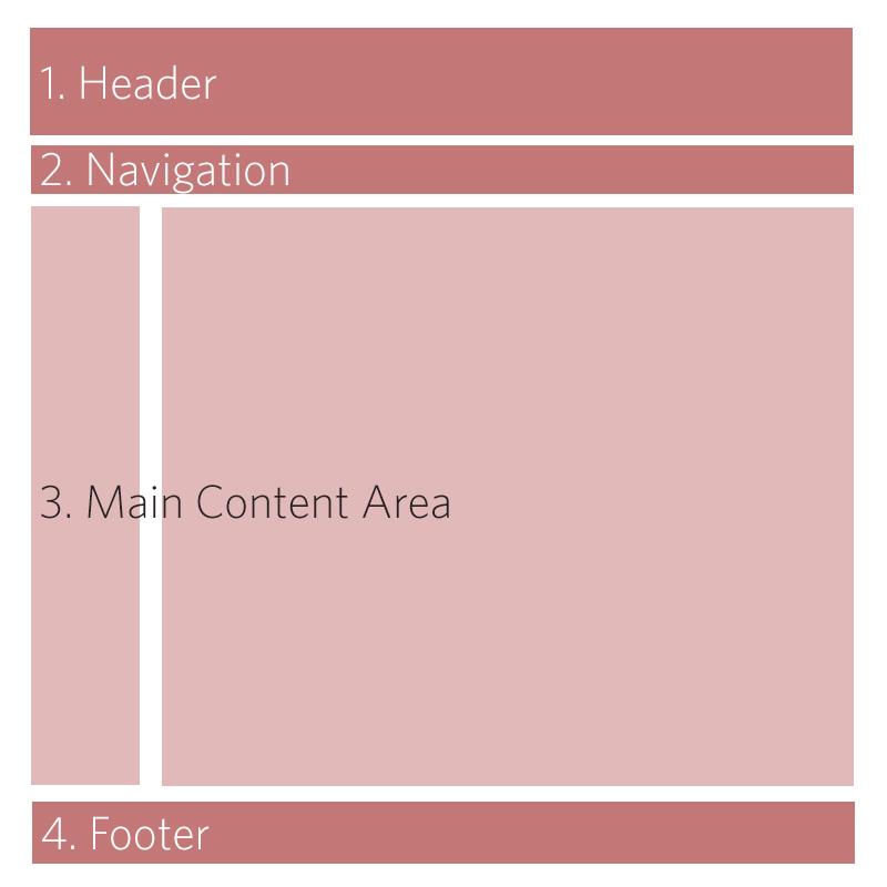
Most corporate websites you come across these days have fallen into a very standardized look. (1.) Header for corporate logo and branding message or photo gallery. (2.) A Site Navigation that falls above or below the Branded Header, with lots of sub-pages. (3.) A single- to three-column vertical layout. (4.) To finish it off, a footer navigation that either just repeats the Nav Bar or crams everything about the company in there.
Now I won’t discredit what works, and it’s great if you have a website and it looks good. But any company out there, in any category, is going to have lots of local competitors and tons of online national competition as well. As a brand manager, you need to take a look at what will make you stand out from everyone else while giving the end user an easy and fun experience. Below are two ways that you can create wireframes for the overall layout of your website to work a little differently.
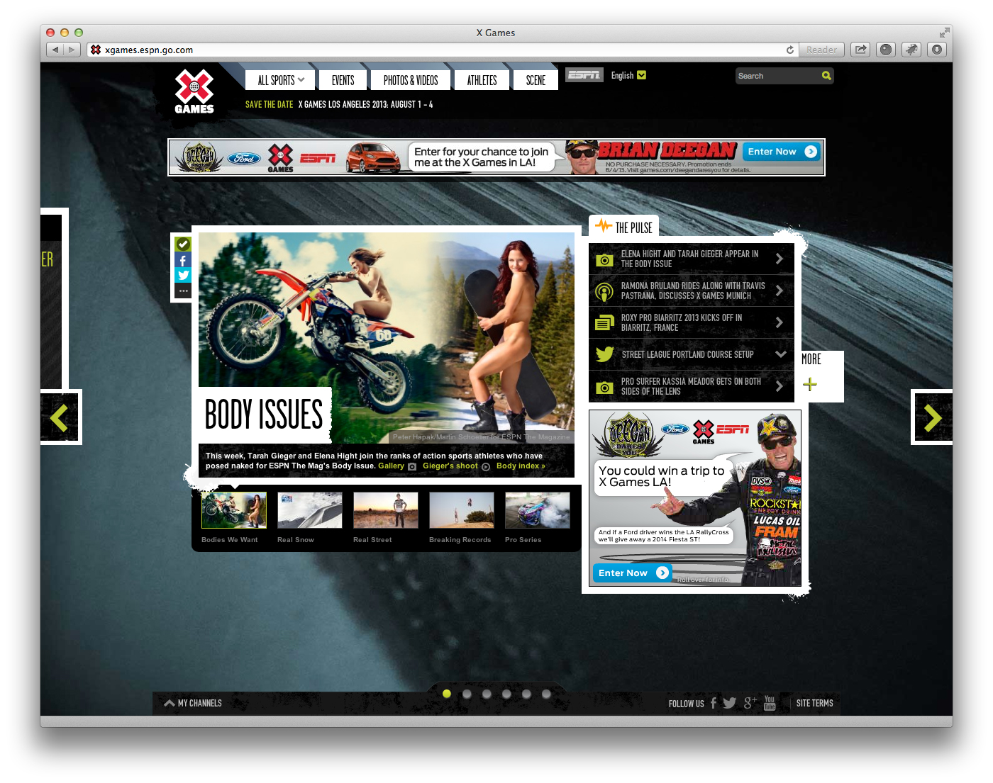
Horizonal Scroll: On most websites, as more information piles up, you stack the content vertically and let the user vertically scroll down the page to read everything. Another way to approach your main content overflow is to have things read left to right. Take the X-Games website for example. The top Action Sports Competitions website organizes the homepage and all subpage categories into single pagesize sections and has the user scroll from left to right between a page’s subsections. The non-traditional navigation is easily figured out by prominently displaying left and right arrows on each side of the page and a Gallery Marker on the bottom of each page.
Another good example of horizontal scroll is the micro-site “Brooks Shoe Advisor.” Brooks Shoes has you answer a series of six questions to help you decide which shoe is best for you. With bright graphics and a humorous tone, they guide you to a final purchase decision and control how much you see by not allowing you to skip ahead until they give the appropriate information.
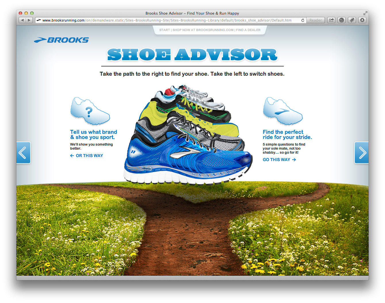
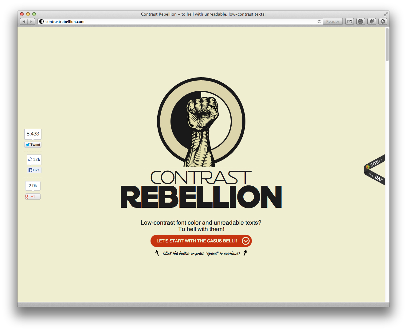
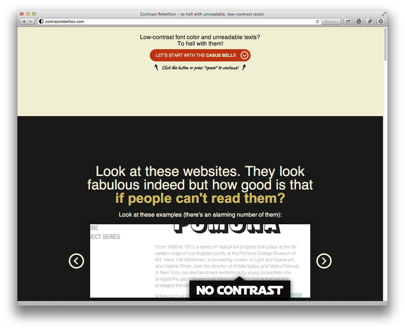
Single-page websites: The Brooks micro-site is also a good example of a single-page website, where the entire content of the site is on one page and you use jump links to get between the sections. Another good example of a single-page site is the web design manifesto website “Contrast Rebellion.” By clicking on the single button on each slide or pressing the space bar, the site will vertically scroll down to the next section. For small companies or spin-off websites this is a way to stand out from the competition and control the pace that the user reads through site’s content.
However you do organize the content for your website and shape the overall design, you need to research your competition and decide how you can stand out from the pack in a way that also makes the end user experience the easiest and most effective.