
As an Art Director, I tend to look closely at a lot of advertising and design out in the world, whether it is targeted at me or not. I also tend to think about how I would change it (or sometimes I wish that I had come up with the idea myself). Either way, this is the first of a somewhat regular series of posts here on Insights that will review work that I have seen recently, with some quick thoughts about each piece. I have chosen one thing from a few different categories. Enjoy!
Website Design
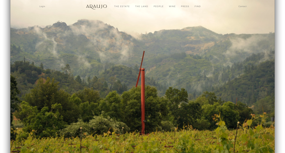
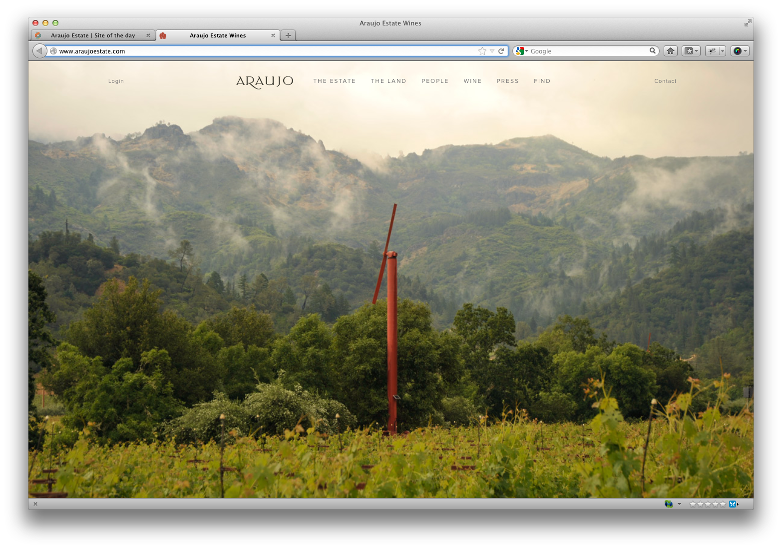
The website for this Napa Valley Vineyard is beautiful. The homepage is nicely minimalistic with just the Site Navigation and a large, inviting photo of the vineyard itself. This image and all of the ones on the site have been given a nice warm sepia tone to it to it. It borders on being “Instagramed”, but I don’t think it it goes far enough to fall into that cliché. Once you click through to the sub-pages, you are presented with a lot of content, but it is well-paced using large photo galleries and a neat fade in/out treatment as you scroll down to help bring what you are currently reading to the foreground and the previous and next sections to the background.


Print Advertising

This print spread for Hermes in the Holiday issue of Departures Magazine really just makes me angry the more I look at it. I think this ad shows an example where the product gets in the way of the concept the creative team came up with. The headline of “Time on Your Side” with the background landscape changing from fall to winter is actually a nice concept. Unfortunately it took me looking at the ad for far longer than any normal reader would to see that this was actually happening because the scarf that the woman is wearing is flowing like a cape off the back of her head. It’s huge! Not only is it huge, but I am stumped about how this thing is not only wrapped around her head but blowing in the wind like that. I jumped on the computer and went to Hermes.com to see the scarf and hopefully find it’s enormous dimensions. That’s where I came across marketing blunder #2. I can’t find the scarf on their website. I’m sure Hermes has more than one print ad out there right now, but if you are running a spread ad in a major magazine, you should have the featured product in a prominent place on you site, just in case someone might, I don’t know, want to buy it.
Logo and Identity
![]()

The Houston Astros this past week revealed a new logo and identity for their team. Overall I think this is a nice redesign, mostly because it stays away from the trend in sports identities to be loud, busy and unreadable. Their old star and script logo (seen below) was, in my opinion, awful. I assume the partial star was meant to convey movement but just looked unfinished, and it really bothers me that the ligatures have no consistent connection point and don’t at all flow like a handwritten script should. Looking even farther back at the history of all of the logos they used I would say that this new version is the best done yet.
![]()
Online Advertising
Since I am an art director, it seems like Adobe follows me all around the Internet. While I do view re-targeting as kind of creepy, it has exposed me (a whole bunch of times) to this series of well-done banner ads from Adobe promoting their Creative Cloud and specifically their new Muse program (refresh your screen to see full ad). The combination of movement in the pieces and the accurate portrayal of the program’s simplicity results in a smart and effective use of dynamic space.
Video
And finally, to welcome us into the holiday season I thought I would include this spot from Acura featuring Suze Orman. Without blatantly screaming about their features and handling, they just show us how well the car drives. This is one of the few auto ads out there that doesn’t just show the car in motion. It’s funny and relevant to the season while subtly showing the quality of their product.