
Living in southern Connecticut, I have read several articles over the past year talking about how three of Fairfield county’s major cities – Bridgeport, Norwalk, and Stamford – are undergoing major rebranding efforts. Stamford and Norwalk are still in the planning, research, and design phases, but Bridgeport began launching its new marketing campaign this past spring and summer, and I think the other cities can learn a few things, good and bad, from the Park City’s efforts.
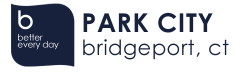
Let’s take a look at the new logo (above). There are a lot of things happening here that I am not getting. The first being that the name of the city falls last in the reading order after “b,” “better every day,” and “Park City.” The second thing that irks me is the fact that we are introduced to two taglines. Is the logo saying that Bridgeport is better every day or that it’s the Park City? Finally, I am underwhelmed by the logo in general. Taking out the fact that it is saying too much, the mark itself is a generic, uninspiring flag…I think. Unfortunately for the design team, I imagine that this was a design-by-committee project, which would explain how everything but the kitchen sink got jammed in there.
Next, some positive feedback. I must say the commercials that were produced are doing a much better job of selling the city than the new logo. They are well produced and display the good things happening economically, and for residents who live there. And they actually pay off the tagline of “better every day.” You can see one of the spots above, and view all of them in the videos section of their custom website.
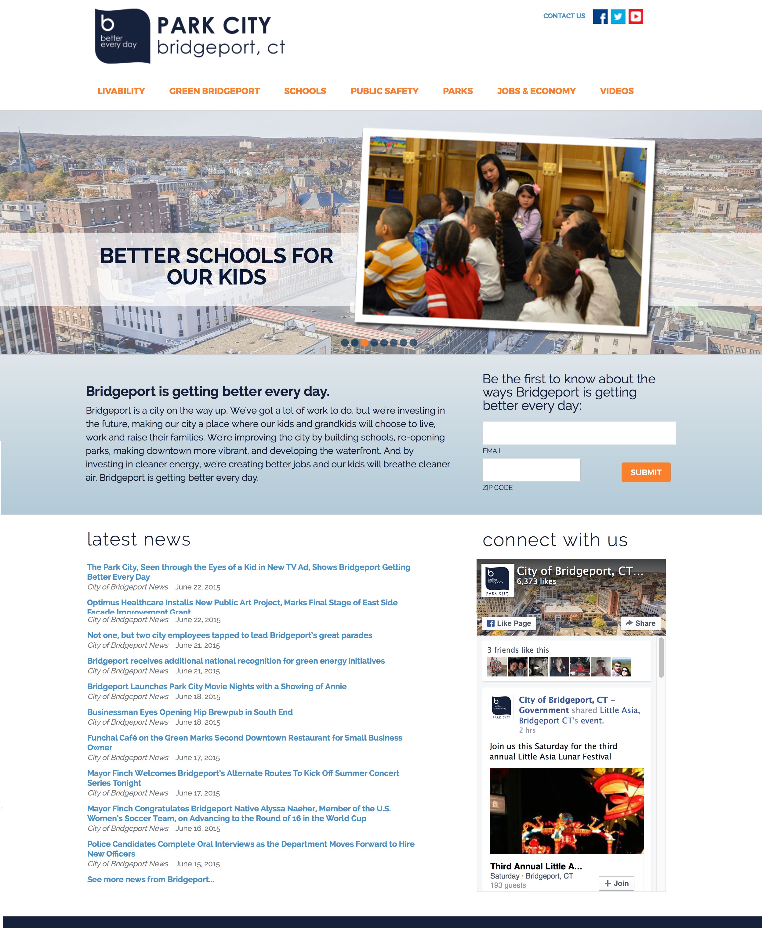
Lastly, about that new custom website. The city has purchased the vanity URL bridgeportbettereveryday.com and has created a portal to show off all the good things happening in the city. Aside from the fact that the URL is a mouthful, the website is doing a good job of promoting what’s new in town, as well as addressing and alleviating peoples’ pre-existing notions about safety and the quality of schools in Bridgeport.
This rebrand is definitely less about pushing tourism to Bridgeport and more about attracting new residents and businesses. Overall, the execution of the campaign has been well done, but the initial step of logo creation could have been handled better. For the logo, since “better every day” seems to be the theme of the campaign, I would urge the city to drop “Park City” from the logo and its marketing materials. Some rebranding advice for cities like Norwalk and Stamford: look to Bridgeport and learn the value of a simple, unified message.