
What do all luxury outdoor living brands have in common? They are driven by design. They manage to work design into all areas of their company. This can include product development, branding, service design, user experience, and more. According to dmi.org, design-driven companies were 211% more successful than competitors of the S&P 500 over a 10-year period. The answer is clear, less is more. Being more design-driven in your decision-making process and overall branding may be that one step it takes to get ahead of a competitor, leading to more sales and more customers.
Below are a few design treatment examples from our advertising agency on how you can elevate your outdoor living brand to feel more luxurious:
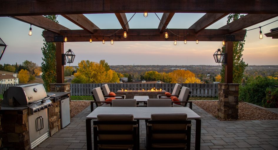
Simplicity
Outdoor living brands with a luxury branding strategy always keep things simple. Using very few elements while staying true to a minimal layout, color palette, and photography can elevate a brand to feel much more expensive and professional. Keeping elements spaced out leaving more white space on a page gives a more sophisticated look.
Typography
Many luxury brands use similar typography in their logos. When placing some of the most popular luxury brand logos next to each other, you can see they divide into two categories, Serif and Sans Serif fonts (pictured above). In my opinion, viewing as a millennial, the serif category gives off an older, more established look that displays trust and traditional elegance. The Sans Serif category on the other hand makes me think of a newer, risk taking, bold brand that has a younger, more confident look.
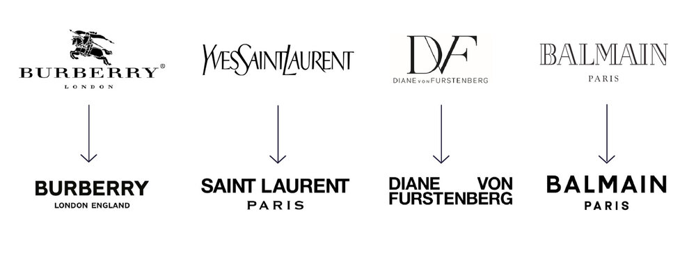 (Image source: thefineryreport.com)
Limited Color Palette
A common luxury branding strategy is to stick to a very minimalistic color palette (if any). As you can see in the previous section image, most luxury brands are just black and white. This is another instance of extreme simplicity of the brand. This is not to deter you from using color at all, for example jewelry company Tiffany makes great use of their Tiffany Blue color. The end goal is to not use so many colors that your brand mark can become distracting or overly stimulating. A cool, crisp brand mark that sticks to neutral colors or black and white is a great starting point.
In conclusion, it is clear that simplicity is the key factor in creating luxury outdoor living brands. Putting irony aside, this is a difficult task to pull off. There is a reason these massive luxury brands can create their exclusive, tightly knit crowd of consumers who would quite literally do anything to have their products. It takes a well versed, experienced team of individuals to elevate the status of a brand. Mascola Group can help you get there. Contact us, your go-to advertising agency, to get started on your luxury branding strategy.