
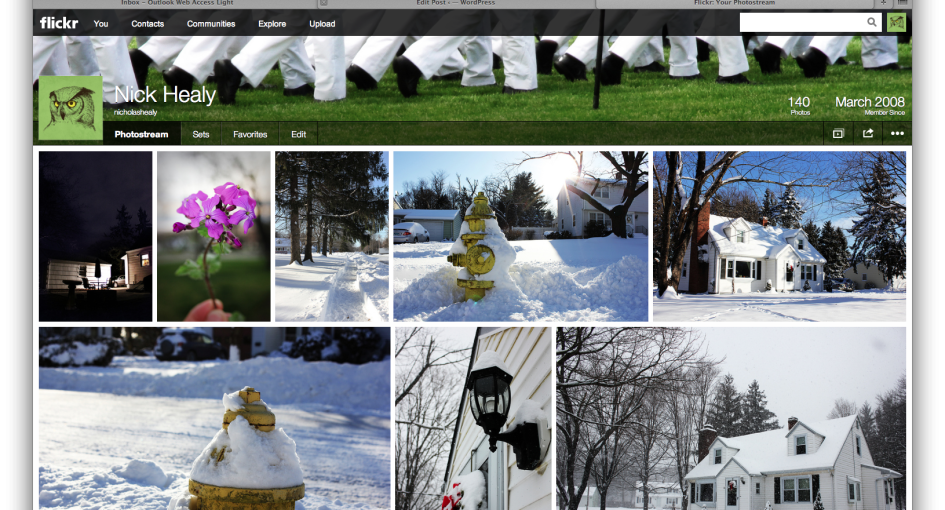
Flickr has launched a website redesign, and I’ll be one of the many to say that it was long overdue. The launch of the new version of the website and their recent update to their mobile site/app comes just after big news that Yahoo (who owns flickr), just purchased Tumblr for $1.1 billion. The biggest news for flickr outside of the new aesthetic features is that users now have 1TB of storage compared to 300MB in the past. Below, you can see the new desktop versions of my photo stream and logged-in homepage.
The newly styled navigation bar along the top of the site is easy to read, and I especially like that it now has a fixed position at the top of my screen, no matter how deep I scroll into the stream of photos from my contacts.
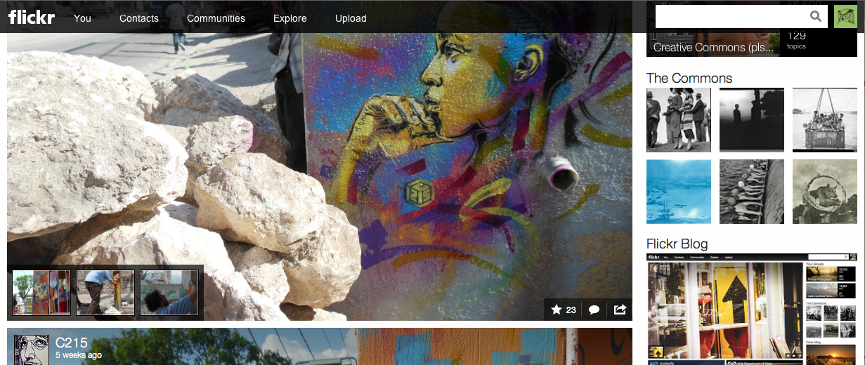
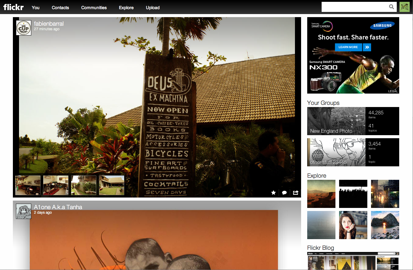
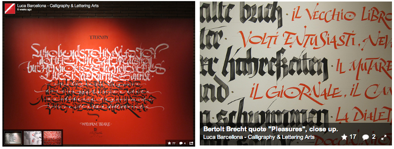
I don’t like how they have chosen to use two different styles for overlay of information on photos for the homepage stream and for an individual user’s photos. On the homepage stream overlays, there is just too much happening (shown below on the left). In the upper left corner we see the user icon, name and title, and along the bottom are the options to star, comment, share and — if the photo is part of a set — we see inset shots from other pics in that set. I much prefer the single black pop-up bar on individual photos (shown below, right).
Overall, I will say they both put much more emphasis on the photos that I and others have uploaded, which for a photo-sharing site makes plenty of sense. I think this website redesign is a big improvement over the old version, with less white space and more photos (again this is a photo-sharing site). But the thing that I can’t seem to get past is how similar everything looks to Facebook, Pinterest, Instagram and almost every other social network. Apparently in the social world it does not pay to differentiate from your competition too much. I guess these days if you want to have a social network, the design of your site needs to include a large cover photo with an inset user icon photo as a header and a montage of pictures/tiles of information underneath it. Voilá! You are now the proud owner of a social network. It makes me wonder if the design team or the Yahoo corporate team were the ones to say. “Let’s take a look at everyone else in this space and make it similar, but just slightly different.”
This copycat mentality is certainly not a phenomenon that only takes place in the social arena, but it seems pretty prevalent here. I think that this should be a reminder to us as marketers of one of the basic ideas in advertising – identifying your USP. Figure out what is unique about your product or service that your competition can’t claim, and let that shine — in every medium. The general public wants to know why you are different and why they should use you versus the other guy. Once you figure out your USP, it should be carried out across the design and message of your advertising, website, packaging, etc. Really you should be constantly thinking about how you can stand out from the competition, not blend in.
I’m certainly interested to see what happens when Yahoo attempts a website redesign on their newest acquisition, Tumblr. Will they buck the trends, or should I just look at today’s blogging space to see Tumblr’s future?