
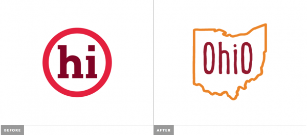
To follow along the theme in my post about cities in CT rebranding, today we go national and take a look at the state of Ohio’s rebranding effort. Launched in November, the new Tourism Ohio logo is definitely an improvement over its predecessor, but that’s not to say it’s a great mark. The old logo was confusing and seen out of context is difficult to understand. The new logo, while easy to understand is pretty bland. The silhouette of the state wrapping around the name is not terribly clever, and the “hand-drawn” approach to the logo and typeface actually seems mechanical.
I discovered the new identity in an article on Brand New, a blog dedicated to reviewing rebranding projects. They had similar thoughts on the logo but focus even more on the choice of visuals in the campaign. And I must say I agree, the photos they use are all extremely forced. If you are going to use lifestyle photography in your advertising, it is extremely important they don’t feel posed or have models with fake smiles.

The shot on the left of the kids rocking out in front of the Rock and Roll Hall of Fame is one of the cheesiest I’ve seen in a while. The only image that doesn’t feel extremely forced is from the “happiness” ad in the upper right. The models seems to be giving us some genuine emotion, however the picture shows me nothing about Ohio. These two people could be anywhere in the world. In general, whether you are selecting a photo or a typeface, you should try for a visual that comes across as authentic and not posed.
The images here are from the article on Brand New. Click on the link for more examples from the campaign, including the TV Spot.