
In the first week of January, CNN launched a new version of their website to the world and I must say, I am conflicted. They got a few things very right, but a few things very wrong, too. Below is a quick assessment of my experience so far, and even though CNN is a news outlet, these are items every brand should keep in mind when building or modifying their site.
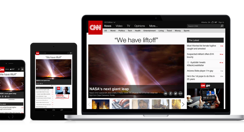
1. Responsive “mobile first” design: The new CNN website is a responsive design that resizes the content and rearranges items based on what device you are using. With so many options for people to arrive at your site, this is a must have for 2015.
2. Less visual clutter on the homepage: The old CNN homepage was a mess. There was a lot of information crammed into a very tight space, and while the new site contains pretty much the same amount of content, it has been organized differently. Through a better visual hierarchy, section dividers, and some white space, the new homepage is much easier to digest.
3. Social sharing: While the old site did have social share features, the more prominent buttons are now located on a fixed sidebar to make it much easier for the reader to share articles and videos. To take social sharing up a notch for your own website, consider adding a ticker to show the number of times users have shared the content. This can help incentivize others to do the same.

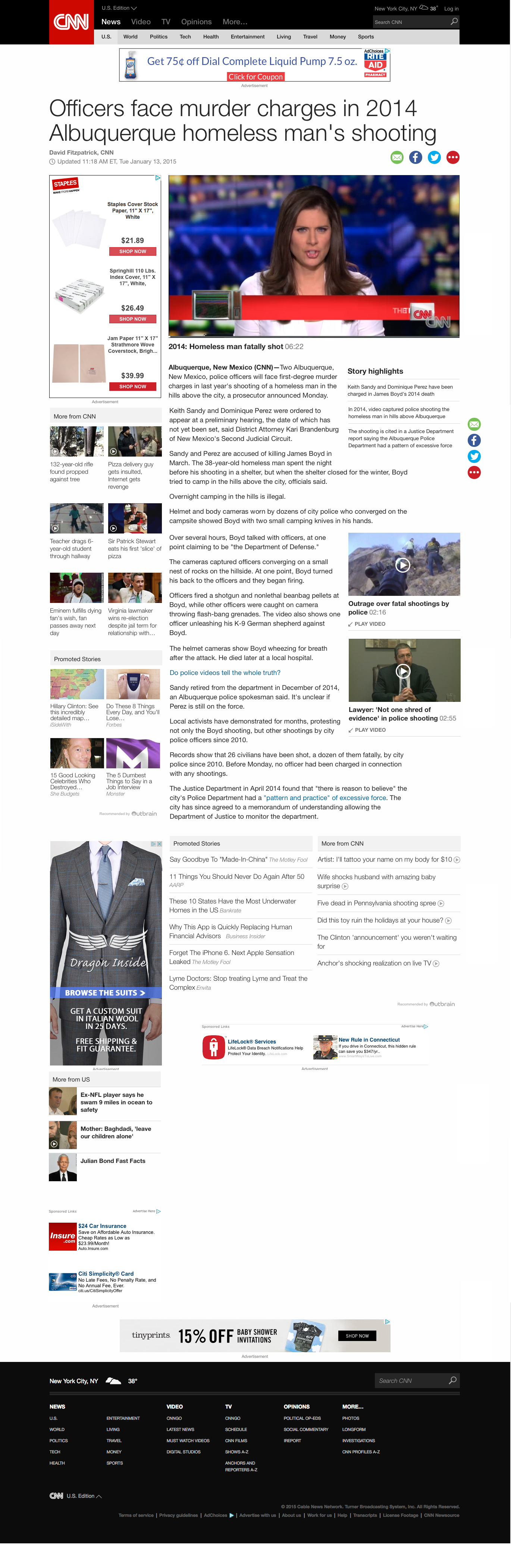
1. Way too much clutter on article subpages: While the new homepage has a much nicer layout, the individual article pages are still very busy. The top portion of the page is not my problem, at least not until I dive into attempting to read the actual article. The right and left colums are so crowded with advertisements, promoted links from other sites, and links to other stories on CNN, that it makes it hard to accomplish what I came to this page to do: read the article!
Below is from the desktop site, and the mobile version becomes even tougher – instead of three vertical columns, the ads and promoted content are placed right into the middle of the story.
 2. Auto-playing videos: This is personal pet peeve of mine. Don’t start automatically playing a video. Yes, I understand that CNN makes news videos and there is one on every page, but when said videos always begin with an advertisement and I am trying to read the article transcript in a quiet environment, being greeted by the sound of a Geico commercial on every page gets old quick. If I want to watch the video, I am more than capable of figuring out that the small white arrow means play and I need to click on it.
3. Much slower performance: The new CNN website seems to be slow, and according to a review on DigiDay, it takes up to three time as long as the old site to load. In general, if you are releasing the latest and greatest version of your product, it should be at least as good, if not better, than your old one.
According to CNN Digital editor-in-chief Meredith Artley (in the same article on DigiDay), CNN is aware of some of the early issues. But she added that the new CNN.com is more of a soft launch than a final product, and CNN plans to tweak parts of the site over the next few weeks and months as it monitors performance and user behavior. Let’s hope that this is true and not just a quick response to bad criticism they are receiving from users (just read a few comments on their own announcement of the new site).
From a visual standpoint, I like the CNN.com relaunch. But as far as functionality goes, it needs some work. For your own brand’s website, finding ways to reorganize ads or promotional content to be less invasive is a key to keeping users engaged. And I can’t be the only one plagued by autoplay – you need only to Google “autoplay videos” to find myriad articles on how to make them stop. That should be a sign in and of itself. Finally, if your website suffers from slow page loading time, it needs to be addressed now. For retailers, the difference between one or two seconds in loading time can mean millions of dollars in revenue lost. Constantly test your site for optimal speed, usability, and mobile-friendliness to ensure the best user experience possible.
Ben
28 Feb, 2015 - 08:23 amIt’s awful. I don’t expect it from CNN but they’re the best example of how the internet has been destroyed by advertisements. It takes me 16 seconds to load the page on very fast hardware and internet connection. Most of the time spent on HTTP GET’s to ad services. It’s also quite comical that their videos that are supposed to play after the ad doesn’t even play. Horrible web site, and very very sad that I can’t get news anywhere online without this kind of experience.
Rich Lando
19 Mar, 2015 - 12:40 pmThe new look is visually appealing but I have found the site to be much slower and the experience is terrible. Too much clutter and ads and on many articles superfluous videos that start automatically with an ad at an unreasonable volume, runaway page memory from all the ads reloading make this unbearable for any amount of time. After 5-10 minutes on any CNN page memory goes to more than a half a gigabyte in I.E. 11. I think this “upgrade” is a massive fail.
Tom Psillas
18 Apr, 2015 - 11:11 amI stopped going to CNN completely. The website is way too slow for DSL. I 100% do not tolerate autoplaying videos.
CNN is done in my book. They just went the way of AOL. I did work for them back in 2000 and I must say, they never really got it, since Ted Turner was gone.
Corey Kech
21 Apr, 2015 - 11:03 amCNN has been my home page for years now but this new website redesign hangs even on my brand new Mac. The auto=playing video’s are a nuisance especially when trying to take a peek at the news while at the office. Sorry CNN….but you have brought spoiled milk to the market and have literally forced me to abandon you as my go-to news page. The site is unusable.
Ray
17 May, 2015 - 09:16 amThe CNN news are great, the team who design the web site should all be fired. They start with the sport section, there were lot of complaint, people just hate it, they have the deaf ear. Now they screw up the entire CNN web site
John
06 Jul, 2015 - 07:53 amThe site has been unusable for me this past week. A runaway script? Memory usage yo-yos up to a gig and back. My 4g box sits frozen while it presumably attempts and fails to open ads for me — my adblocker is on. A side effect of ad blocking is that none of the CNN videos will play for me unless I disable it. Sorry CNN, but my computer is mine. I will be looking for new news sites.
Shun
19 Jul, 2015 - 20:48 pmThe WORST website I’ve ever seen. Ever since they launched the new website, it’v very very slow, too much junk, trying to cram too much information on a single page. Take forever to load a single page. The website is totally USELESS and WORTHLESS.
The website must be designed by bunch of interns and newly grads; they designed the website for themselves, don’t even think about the end user’s internet experience.
It’s so bad that I don’t even use it anymore, just wasting my time! USELESS and WORTHLESS!
billy
25 Sep, 2015 - 14:59 pmYep, way too much video emphasis. Not everyone is sitting watching news on androids and iPhones CNN. I hate the snap back video, if that’s even what it’s called. I mean, I skip the autoplay vid just to have it flash real big and slam over to the right when I start scrolling. Is this the work of millennials trying to hipster doofuses in black rimmed glasses??? Stop stop stop.
Sam
15 Oct, 2015 - 10:50 amI’ve gone from disliking it to despising it since the new CNN website launch. If it’s really a mobile first site why does CNN Money not load on my iPhone and hadn’t since June 2015? Why does their text overlay images and type all the time? Or the type itself resize halfway down the page to the image description font size? Why do half of thier stories not load at all? Why couldn’t they leave the comments section instead of removing it entirely so someone could point all these problems out so? Who edits the stories and who does the typography because it’s horrible and difficult to read. Seriously the website is a mess and getting worse every day.
Ivan
02 Nov, 2015 - 13:41 pmThe new CNN site is a memory monster.
The webpage somehow takes up a whole GB of RAM on IE 11 to load all the stupid articles and clips. FIX IT!!!
Craig
05 Nov, 2015 - 20:01 pmCount me as another one who has given up on cnn.com. It used to be one of my primary news sources, but no longer….. way too long load times… dumbed down news items…. too many useless links and videos. No thanks.
The final irony: I wanted to provide them feedback but the feedback form didn’t work! That kind of sums up where I am with this site now.
Christopher hudson
09 Dec, 2015 - 01:56 amVery sad that one has to abandon CNN as a source of news and that there is no good U.S. Website for world news despite the decent and timely reporting that CNN still offers. But for those accessing the site in any normal ( non- super connected) circumstances it just doesn’t work. The Read More sections of articles never open, the excessive videos gum everything up, and of course the ads are way too intrusive. Is there no decent text only source of truly current news out there?