
Who doesn’t love a good rebrand?! It can add life and sales to an old product line or it can introduce a new audience to a product they’ve never seen or may have overlooked before. A rebrand can go horribly wrong, as with Tropicana’s packaging redesign and the Gap’s rebrand a few years ago. These both ended up with extreme backlash from audiences old and new, and both were quickly changed back.

![]()
Or it can go amazingly well, as with the update to the entire Levi’s marketing campaign. I first came across this project, brought to us by Turner Duckworth, in this year’s Communication Arts Design Annual. According to the blurb in the Annual, Levi’s has recently moved to a centralized global business model and needed to create a visual identity that celebrated their heritage but positioned them for the future. This is something that you hear a lot in design and advertising these days “make it retro but still look modern.” For the most part it is easy to accomplish one or the other, but not both at the same time.
![]()
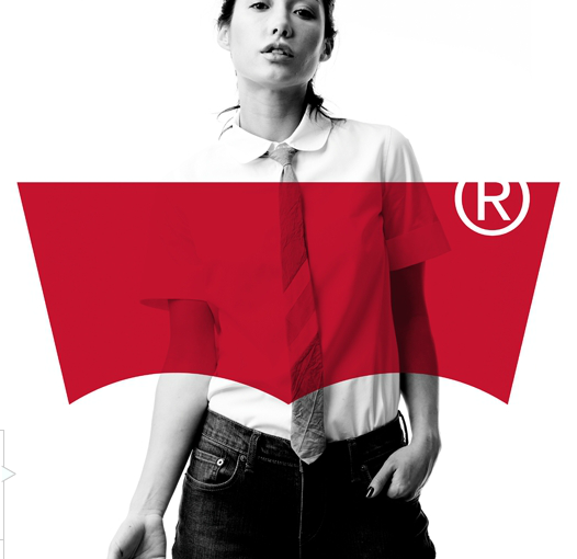
Taking a big step, they choose to lose their word mark and focus on their iconic “batwing” icon. Not many companies can get away without having their name in the logo or in a prominent position on their branding, but I think they have pulled it off well. The missing word and bright red patch help to create bold marketing graphics like the one below. The retro styling of the model and photo shoot, paired with the new mark, bridge that gap of old and new perfectly. On the actual jeans and stationery they have also redesigned the secondary “two horse” symbol to be less cluttered and easier to read. The redesigned logo also appears on clothing tags and store signage.


Now the only thing to do is wait for public reaction and see if Levi’s stays with their new direction. Personally I hope they do.
——-
Note: All images of the Levi’s Project were taken from the Turner Duckworth Website.