
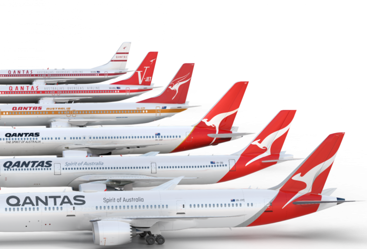
With the addition of the Boeing 787 Dreamliner to their fleet next year, Australia’s Qantas Airlines released an updated logo and livery to match. See the old and new logos designed by Houston Group below.
![]()
To start, the new type treatment is a huge improvement. The old font was too bulky, the letter spacing was not consistent (due to the italics), and – to get real nit-picky – the curves on the tops of the A and S were choppy. On a brighter note, the new typeface is nicely spaced and has a clean and modern style – which feels more appropriate for a leading global airline.
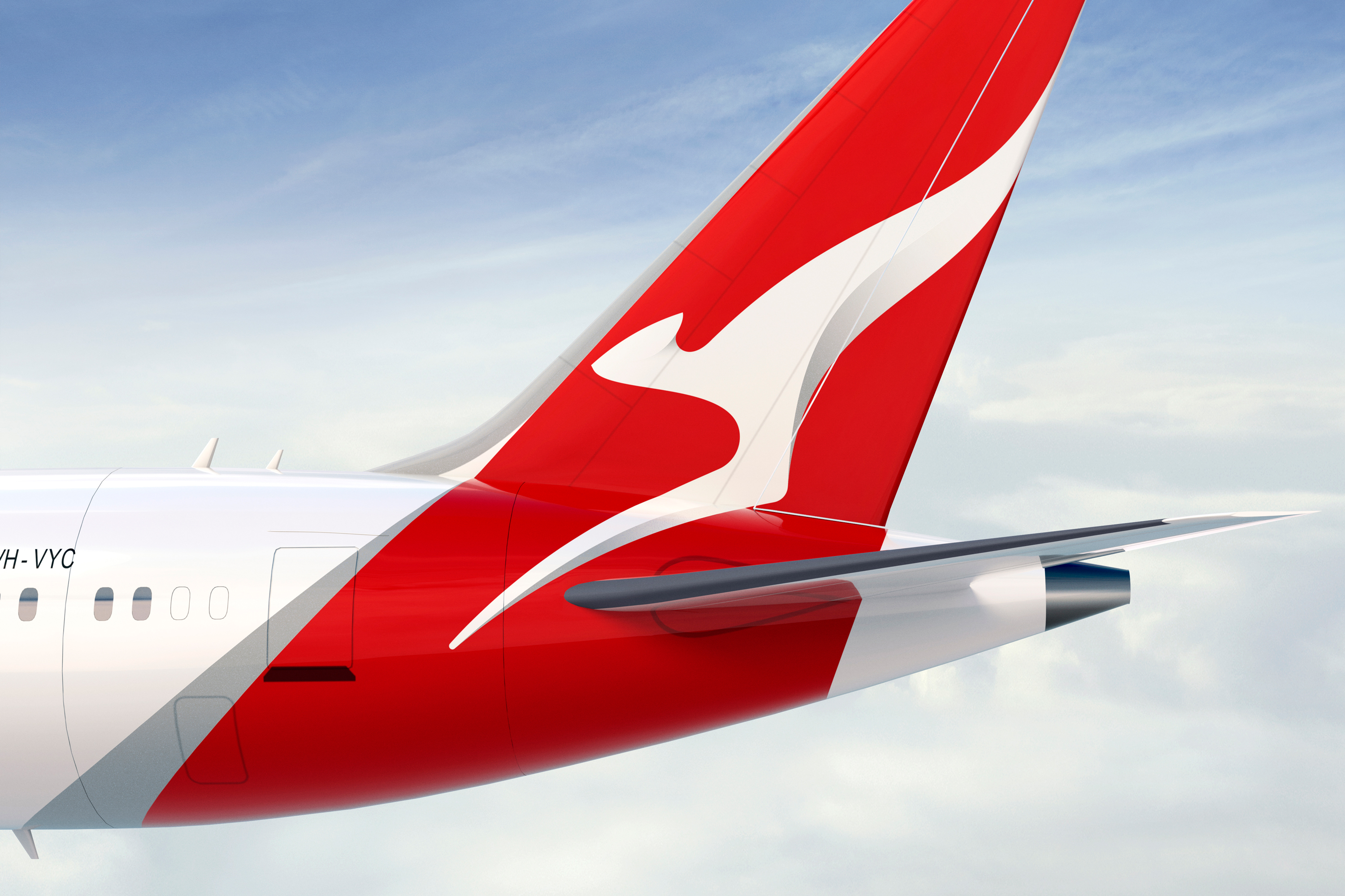
The new kangaroo mark is where this logo loses it for me, like the icon was edited without purpose – streamlined, but not in a good way. The removal of the marsupial’s front arms makes the logo look too abstract, and makes it difficult to decipher what animal it’s trying to emulate. The gradients are a nice touch, they add a little dimension and movement to the mark. I wish they had just added those to the previous mark and stopped there.
Reading the press release on Qantas’ website and the case study page on Houston Group’s site, it was really interesting to comparing the old designs with the new. Their last of version of their logo was definitely the nicest, but the new design is certainly better than the kangaroo with wings.