With the 2012 London Games over and done and all of the athletes gone home, we can also say goodbye to the much maligned logo that was created for this year’s Summer Olympics.
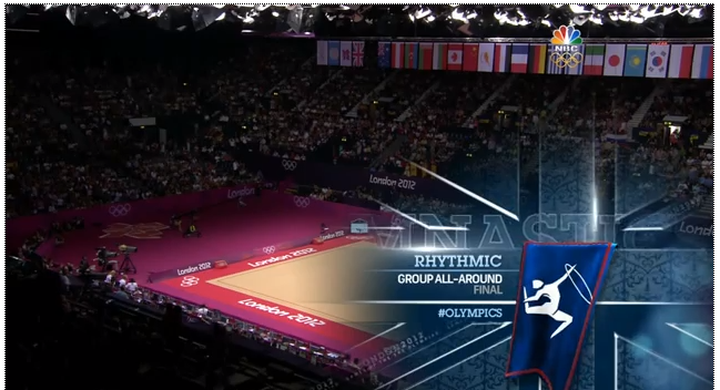
Not only was the quality of the identity hotly debated, but I noticed a huge lack of its presence on-air during the actual games. I caught glimpses of it on the banners and signage in the stadiums and arenas, but NBC decided to completely step away from it and use their own “Big Ben” logo for all broadcast and online items.
And when the official logo and brand system was on display, I found this juxtaposition of two completely different on-screen identities to be confusing. The red white and blue from the NBC logo and color scheme clashed with the bright magenta mats and signage at the events.

But let’s look forward and not backward. Even though the 2016 Summer Games in Rio are still four years away, there is apparently a new identity system already created, and this one is beginning to be discussed a lot as well, but in a much more positive light. And I must say, it does a much better job at capturing the spirit of the Summer Olympic Games.
To go along with the finished mark you can see a behind the scenes video on the creation of the logo from the employees of Tátil, the Brazillian agency that created it. This video does a great job showing the thinking and process that goes into a logo, a nice glimpse into the minds of some talented creatives. Enjoy!