Those tasked with marketing luxury retirement communities have an extremely difficult job. They answer to many masters, target two (or more) audiences, and – whether serving as Marketing Director, President, or any position in between – often have to deal with lots of complaints about minor things.
If you are one of these people, and especially if you’ve been doing this for a while, dealing with the complaints has likely become second nature for you. But advertising to this group can be just as tricky, and it’s easy to go down well-worn, poorly trodden paths. Here are a few things you should avoid in your messaging and layout when targeting luxury retirement community prospects:
- Don’t talk directly to the sons/daughters of your main target audience. Yes, they are looking for help with their parents. And yes, they want the best for them. But you are dealing with (primarily) healthy, educated seniors who know what they want. They will see your ad. They will respond better if you talk directly to them than if you try to reach their kids. That doesn’t mean your secondary target audience won’t see the ad too – they’ll just have a better chance of convincing their parents to consider your community if the message is right – in your ads, your brochures, and on your website.

Error #1 – Talking only to the kids
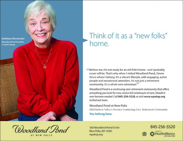
- Avoid cheesy photos of seniors. Again, these are smart, healthy people who are likely active and have more modern views of life than we often give them credit for. They like to move, socialize, shop, eat good food, and can probably drink you under the table. Keep it contemporary, fun, and full of life.

Error #2 – The cheesy couples shot
- Just say no – to puns. Your community has a real point of distinction over competitors. Once you figure out what it is there’s no need to rely on silly plays on words to get your audience’s attention.

Error #3 – Silly puns, goofy smiles, and a horrible layout
These are just a few of the common mistakes luxury retirement communities make in their advertising. There are many who are doing it right – keeping the messaging light, fun, and empowering, and the visuals modern and attractive.
