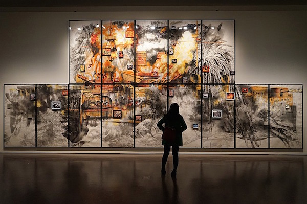
Museum advertising photography, when shot correctly, can make or break an ad campaign. It seems easy enough. Just hire a great photographer, and you’ll have a plethora of perfect pics to choose from when you launch your next ad campaign. But it is seldom that simple.
One of the main challenges comes not from the visuals you get from the award-winning photographer you hired, but from the photos you receive from whomever owns the traveling collection that has now become your feature exhibit. Here are some of the challenges you might face, and how you can overcome them.
- The Consumer Doesn’t Get It. Even if your core audience is made up of the most sophisticated museum connoisseurs on the planet, you should select photos that will resonate with everyone you’re looking to attract, especially families with young children who spend so much time (and money) visiting museums. If they don’t understand what they’re looking at or the headline doesn’t explain it in an interesting way, they will flip the page.
- Your Photo Is Too Busy. Let’s say you’re featuring a collection on vintage animation. You desperately want to show Porky Pig (everyone loves Porky Pig), but the only photo you have has him out-of-focus in the background and other unidentifiable characters in the foreground. Don’t show Porky. Find a close-up of Betty Boop or Tom & Jerry (or whomever you have permission to use – see #3), and let Porky fall by the wayside.
- You Don’t Have Permission. Perhaps you’re featuring the work of an acclaimed artist this season. That doesn’t mean you have the rights to all of their art. Before you even sign the contract with them, try to negotiate the use of as many photos as possible. This way, your creative team will have plenty to choose from when it’s time to design your collateral pieces, website, and ad campaign to promote the collection.
- No “Flair” Allowed. Some traveling exhibits will allow you to add illustration to a photo or alter the photo in some other creative way to make it stand out. But this is not often the case. Make sure you know what the creative team can do and what they can’t.
- Too Many Photos in Too Small a Space. Avoid photo montages at all costs. You may have several good photos you want to feature, but each time you add a photo to the mix, you take away attention from your feature photo. You take away space you can use for copy about your exhibits. And you water down your main message. This is even truer in small-space ads than in full-pagers and spreads.
- The Stock Problem. You have unique and amazing items on display. And probably a beautiful space to feature them. There should be no need for you to use stock photography. It is a dangerous road for many reasons, but is completely unnecessary if you have a solid photographer and high-quality shots from your traveling exhibit. Only use the stock option if there is absolutely no other choice.
Above all, the most important thing to do with your website, advertising, and collateral pieces, no matter what the featured collection or what photos you have permission to use, is to put yourself into the minds of your visitors and prospects. Your creative output – both online and off – needs to resonate with them more than anything, all while maintaining the integrity of your brand. It’s a balancing act that is difficult to achieve, but when it happens, it’s a pretty magical experience.
