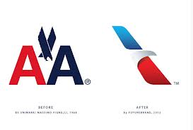
Well, another famous logo design has been replaced recently. This past month American Airlines has revamped their identity, removing the iconic logo created in 1968 by Massimo Vignelli. And replacing it with a system created by FutureBrand. The new logo and overall identity by Futurebrand is nice. I can’t say that I see any major flaws or that I actually dislike it. What I do dislike is throwing out a system that was great and had served the company so well for over 40 years.
![]()
I will freely admit that the majority of people don’t care about logos like I or any other designer may. But you have to understand that we had to take design history classes alongside our art history, and we now put designers like Vignelli, Paul Rand and Saul Bass on a pedestal.
That being said, I will make one more appeal to marketing directors and brand managers out there: you can (and should) consider updating your overall identity and look without losing or changing the logo, especially if you are a brand with some history and recognition of your current mark. (See an article I wrote about Levis recently, who did this really well.)
I fully realize that the old logo looked dated and to appeal to a younger audience and seem like they are keeping up with the times something needed to be done. That being said, take this post as just a rant from a designer who loves simplicity and prefers a logo without gradients, bevels and drop shadows doing all the work.
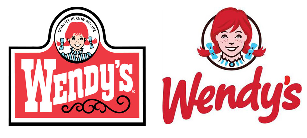
I will end my rant with a few other images of logo redesigns from the recent past that have lost the work of a classic for a “new and improved” mark.
![]()
![]()
![]()