You pass by billboards all the time – some you read; some you don’t. While there’s not really a science to it, there are a few tips tourist attraction billboards should follow in order to get noticed, read, and talked about (that’s really the goal of any billboard). The best billboards even have a little extra to drive it home. Here are the 5 things you should make sure you look at before you produce your boards for the season.
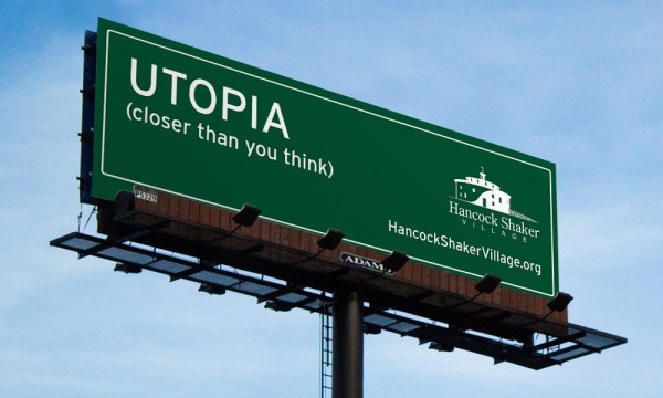
- 8 Words or Less. Some people say 7 or even 6, so I’m being generous. The point is – the most important thing is that people are able to read your billboard. I’m amazed at how many billboards I encounter each month that I can’t even read – sometimes even the logo is illegible. The more you cram on a billboard, the slimmer the chance that your message is actually going to be read. Below is a good example of a simple tourist attraction billboard that acts as a teaser and a buzz-generator, using only a 5-word headline.
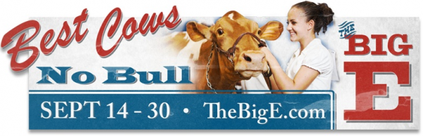
- The Right Font. Your font says a lot about your brand. You need to use one that is in line with your attraction and the emotions you want to evoke from your target audience. However, like in Rule #1, you need to take readability into account. Be careful with serif and script fonts on billboards – they are often more difficult to read. But not always. Here’s an example of a billboard we created for The Big E that used a mix of serif and script fonts, and it was perfectly readable. Perhaps because the message was so short.
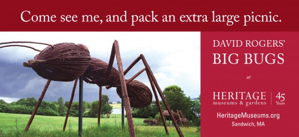
- Just one photo or illustration. Just. One. It is tempting to feature the roller coaster AND the kiddie ride AND the waterslide. But that’s the worst thing you could do on a billboard. People can’t process that much while they are driving, and it makes attractions look like they are trying to be everything to everyone. Just pick the one photo or illustration that embodies your brand the most. Or if you are able to do multiple boards, pick three and rotate them, with only one photo apiece. The board below was a moving billboard, which travelers could read as the truck pulled up next to them (hence the use of a few extra words). The attraction – Heritage Museums & Gardens – has gorgeous flowers, a vintage carousel, and multiple exhibits, but we chose to highlight only one to grab attention.
- NO Cheese. Cheesy puns. Cheesy photos. Cheesy, fake smiles. Avoid the Velveeta whenever you can. As an example of what NOT to do, take the board below, which not only has a cheesy pun – it’s misspelled. If they misspelled it on purpose, that’s even worse.
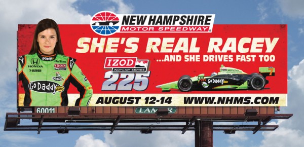
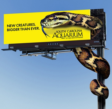
- Extensions. When you see a billboard with an extension, you look at it, simple as that. It’s an attention grabber, and often gives you a little more space for your message. I’ll even give New Hampshire Motor Speedway credit for using one in the cheesy billboard shown in #4. Attractions often have the opportunity to get crazy with extensions, and if you have dollars in the budget to make it happen, don’t hesitate – get creative. This one from the South Carolina Aquarium is a great example of how much fun you can have with extensions.
Creating memorable tourist attraction billboards isn’t always simple, but your message should be. Recall while channel surfing from the couch is one thing; passing by a billboard at 65 mph while dodging traffic is another entirely. Pair a smart, brief, legible message with a compelling visual of your attraction and you’ll have all the ingredients needed to make a great impression.
