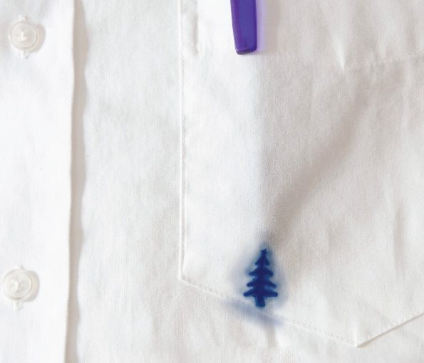
Sure the Christmas tree is overused in ads. You see products galore in the shape of a tree. It’s been done. But for some reason the simplicity of this caught my eye. And I like that the copy is a necessary element instead of just an afterthought. One of my teachers at the School of Visual Arts always told us that in a perfect concept, the visual and the headline are like yin and yang – without one, the other cannot exist. This Tide ad is a great example of that.