Email is a crucial part of a brand’s marketing campaign. Whether you are a B2B or B2C company, a consistent email campaign will help you reach potential leads and stay in touch with your loyal customers. But just sending the email isn’t enough (hope I haven’t burst any bubbles here). You need to craft a message and format that will stand out from the onslaught of items flooding your recipients’ inboxes. Here are three tips to help your brand stand out from the pack.
In terms of overall design, email is one of the toughest challenges in the marketing mix. Emails need to be content rich, but not feel jam-packed. They need to sell a product, but not be too pushy. Ultimately, each email needs to accomplish 3 things:
You must be mindful of a few things. Email code is not website code. Depending on what email program people will view your message on, images will not preload. Only the very top 250 pixels will show before someone must scroll to see more, and the majority of fonts and style sheets available for websites are thrown right out the window. In general, simplicity is king.
A great example of a company doing things right is Apple. I receive their product related emails, usually based around a holiday sale or a new product launch, and they always do a good job of maximizing the platform. Apple accomplishes this first by leading with a text-only message (99% of the time) above the fold, no matter what email program you are viewing in. Second, they use bright, crisp product images that when loaded look great but don’t contain any text or headlines that would be missing if my browser didn’t load the images. And finally, the overall email, while quite long, is broken up into short, easily readable segments all with their own call to action to bring me to different sections of the Apple site. Below you can see how this plays out with their Father’s Day promotion from this past year.
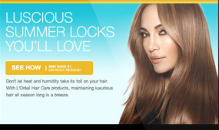
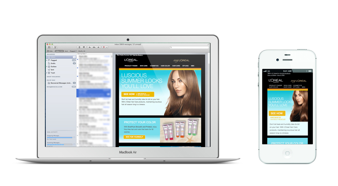
You can’t tell ahead of time what device people are going to view your email on. There are plenty of studies about which audiences are more prone to tablet, mobile, or desktop usage, but in reality, you need to be ready for any of those choices. Make sure your email is built to include Media Queries that will recognize the size of the screen someone is viewing your email in and adjust image and content sizes to best display on that device. It doesn’t matter if you’ve created a beautiful message for a desktop; when someone opens it up on an iPhone, they will most likely not do the pinch-and-zoom routine to read your teeny tiny type unless they are a diehard fan of your brand. Changes to the design of your piece do not need to be drastic to be effective; see L’Oreal’s Webby Award winning campaign below, and notice how the top nav broke into two lines on the mobile version, Call to Action buttons became simpler, and the body copy dropped below the image. The design of the piece remains intact, and so does the message.

Powerful Language
As in both of the examples above, you need to be mindful of the technical design constraints of the email platform, but it’s also important to make sure what you are saying is appealing to the customer. Writing an enticing, powerful subject line that makes readers actually open your beautiful email is even more important than the design. Three things to remember about subject lines:
The Call to Action is equally important. Powerful language that can be seen as quickly as possible can make all the difference in the world in how effective your campaign is. To find out what to do once they click, stay tuned for my follow-up post on landing pages, coming soon.