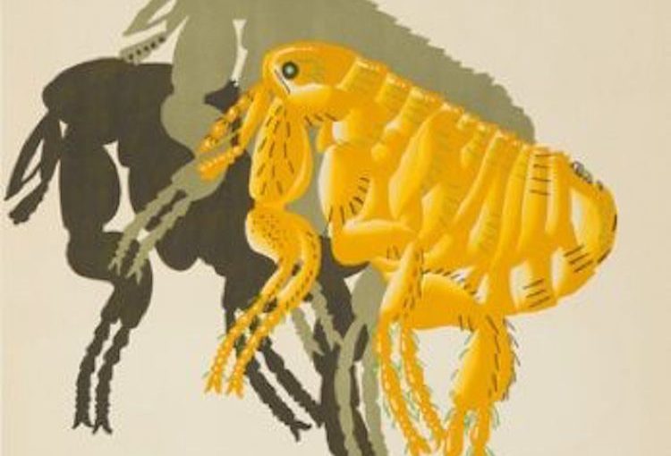
In the graphic design world, the phrase “retro museum ad” can’t help but conjure up famed artist Edward McKnight Kauffer. Kauffer began his career as a painter in the early 1900s, but soon realized his niche was actually graphic art. So, in the 1920s, he turned his focus to design and mastered the art of creating visuals for commercial use. Soon thereafter, he became one of the most highly influential advertisement artists in London in the first half of the century.
Advertisements had to attract the attention of people rushing to catch trains or walking in crowded city streets. With that in mind, Kauffer made his posters bold and memorable, like this 1926 Natural History Museum ad. Advertising a “flea exhibit” might seem like an off-beat decision for a museum, but the powerful copy combined with Kauffer’s simple design make this a very memorable destination ad. This particular retro museum ad showcases Kauffer’s distinct style, as well as a bit of humor.
Kauffer was praised for his ability to turn advertising into a kind of high art. And his posters span many styles – including abstract influences, futurism, cubism, and impressionist ideas. They incorporated bright patterns, Japanese woodcuts, bold shapes and almost “theatrical” scenic backgrounds. Throughout his career, he produced 140 different posters for the London Underground, which included destinations around all over the city.
FUN FACT: Admission to the museum is entirely free, and the destination draws in about 4 million visitors every year (SOURCE: Londontopia).