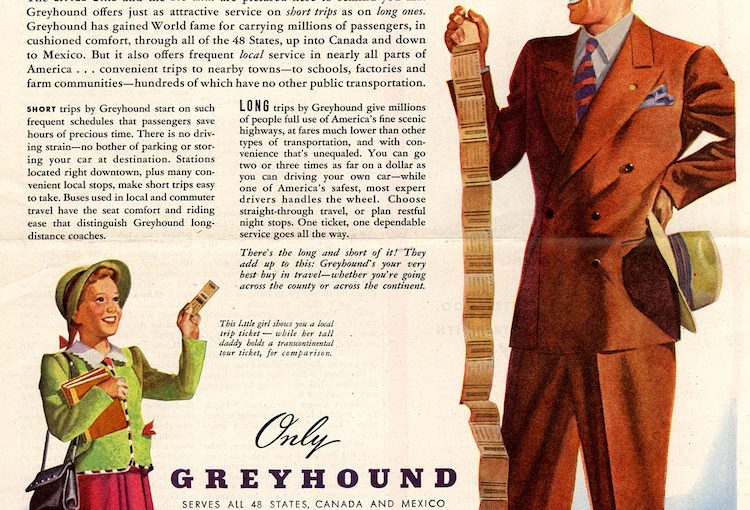
In the 1940s it was common for brands to use comparisons in ads. Often times, these comparisons had little to do with what was actually being advertised. In this ad, Greyhound used the heights of a little girl and a tall man to promote their quality service, even on long rides. The girl is pictured with a ticket for a short trip, the man with a transcontinental ticket. According to the copy, this image represents Greyhound’s ability to take you on trips of any distance in complete comfort:
This is the Long and Short of Greyhound Travel!
The little girl and big man are pictured here to remind you that Greyhound offers just as attractive service on short trips as on long ones. Greyhound has gained World fame for carrying millions of passengers, in cushioned comfort, though all of the 48 States, up into Canada and down to Mexico.
When you think about it, the comparison doesn’t really have anything to do with riding a Greyhound bus. Despite the silly comparison, the ad works in a campy 1940s way.
Greyhound employed Raymond Loewy, a legend in Streamline Moderne design, popular in the 1930’s. He also designed the Studebaker Avanti, the Pennsylvania Railroad’s S1 steam locomotive, and logos for Shell, Exxon, and TWA. (Sources: Thrillist and Wikipedia)