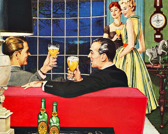
I’m surprising myself by liking an ad with no copy at all. But everything is so simply stated in the picture: if you want your men to get along swimmingly, you know what to serve. Typically in the 50’s, you’d see a line pretty similar to that plastered across the illustration. But the lack of copy actually elevates the feel of the brand here. Bravo Ballantine!
Michael Swedenberg
22 May, 2012 - 10:05 amThis is visual advertising at its best. It was created by an illustrator or a graphic artist by hand before computers and software. Look at the attention to detail on the ladies dresses and the bottle labels. I believe this is a watercolor and was done 300% up from the finished size. At least 15 hours went into painting this great piece. Real old school. Thanks for sharing.
Michelle Yue
22 May, 2012 - 10:08 amThanks for the comment, Michael. It’s nice to find other people who appreciate the intricacies of illustration and old ads.