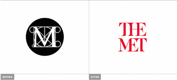
I will first state this. I am obsessed with The Metropolitan Museum of Art. As a child who loved art and grew up on the Metro North train line, I have been going to The Met at least 3 times a year since I was in 6th grade. I feel more comfortable in some of their galleries than I do in my own home. That being said, I was not a terribly huge fan of their past branding, but it was familiar. They played off well known symbolism within the Art and Architecture world to make their ubiquitous “M,” and we have all lived with it since, well I can’t really remember how long. Over the past few days, it was announced that Wolff Olins has developed a new identity for The Met, and in my mind it’s just not the right fit.
I am certainly not alone in my opinion – one writer described the mark as a “typographic bus crash.” While the final execution of the old logo wasn’t great, it was at least nodding to the Renaissance fine art on display within the museum’s walls. The new logo loses this artistic reference and feels like a bad revival of 1970s typesetting to me (and the art I associate with the 70s doesn’t conjure up positive feelings). Both words are made up completely of ligatures that seem to nod more to cramming into a crowded New York subway car than to the big open spaces of the building itself and the expansive beauty of Central Park, which surrounds it. I also really want to fix the tilt on the “E” crossbars; it’s gotta be a mistake, right?! I won’t go on with any more critique, but I will turn your attention to a full review of the new branding on Brand New, where I came across the project in the first place.
Also, The Met has a statement about the new brand identity on its website, but I’m not so sure it clarifies anything about the design choice.
What do you think of The Met’s new logo? Give your opinion in the comments section.