
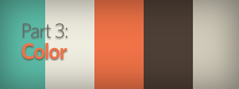
This is the third of a five-part series on ways to make your website design stand out from the competition. See the first part on non-traditional layouts here, and part two on design concepts here.
In the last post of this series we talked about the overall theme for your website design and how photos, illustration and type can help you stand out from your competition. A large part of whatever the design direction your site takes will be the color scheme. The easiest thing to do, and what a lot of designers will do, is take a look at whatever your corporate logo is and apply the same colors straight onto the website. While this may help you stick to brand standards, the easy approach most often will not deliver the most exciting visual experience. Below we’ll look at a few different examples of companies that have used color to their advantage to create some beautiful websites.
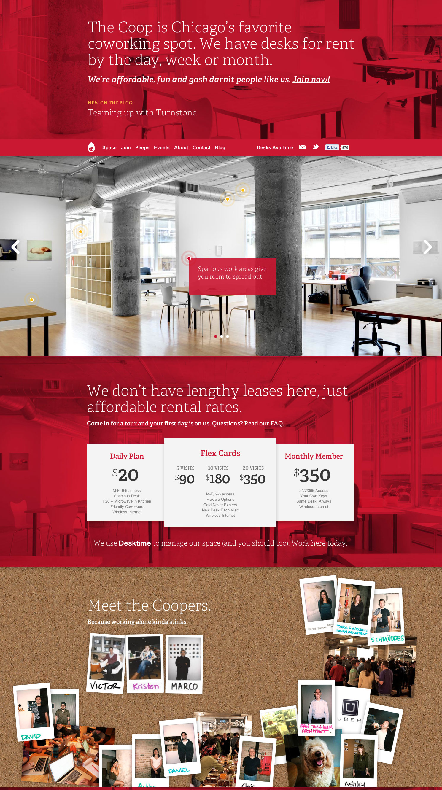
MONOCHROME: One thing you can do is pick a single color and run with it, forget coming up with a family of colors to work with. A great example of a single color website design is for The Coop, a Chicago Coworking Space. They have set a nice, bright red for their site and used it in huge swatches throughout. While some photography here is full-color, as you scroll down the page there is never a point where that bright red is not popping off the page.
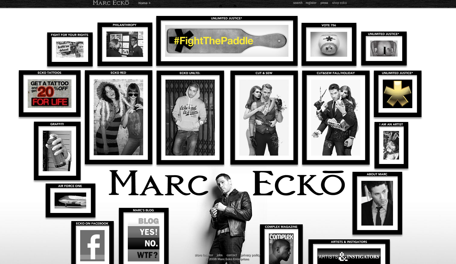
BLACK & WHITE: To turn a complete 180, instead of choosing one bright, bold color you can create a website design that is only black and white. Take a look below at the landing page for designer, artist, publisher, etc. Marc Ecko. On top of creating a near Black and White environment, the site has a great layout, placing the artist in front of a wall of black and white “photos.” Each picture leads to a partner website or subpage on the current site.
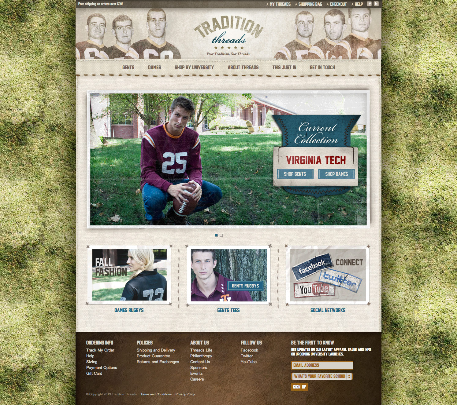
RETRO/SEPIA-TONED: Playing the sepia toned card is a direction that can be tricky. Depending on your category, this style has been used A LOT. However, if none of your competition is using this design style, a retro looking website is one way you can take the color scheme of your site. Befitting to their name, Tradition Threads has created a site that gives a yellow sepia tone to all of the graphics and visuals on the site.
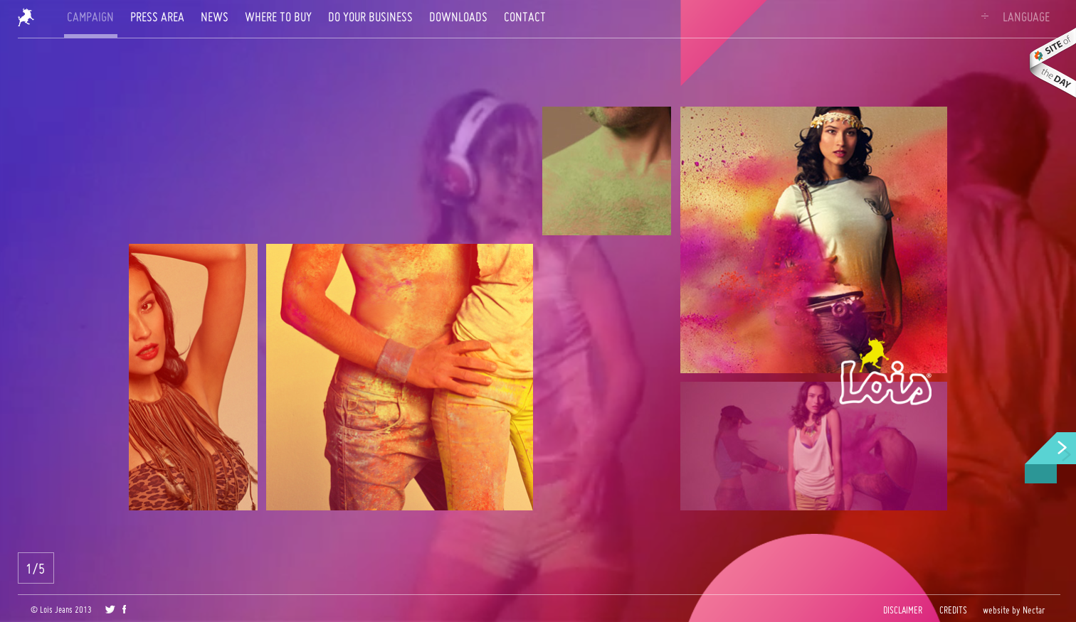
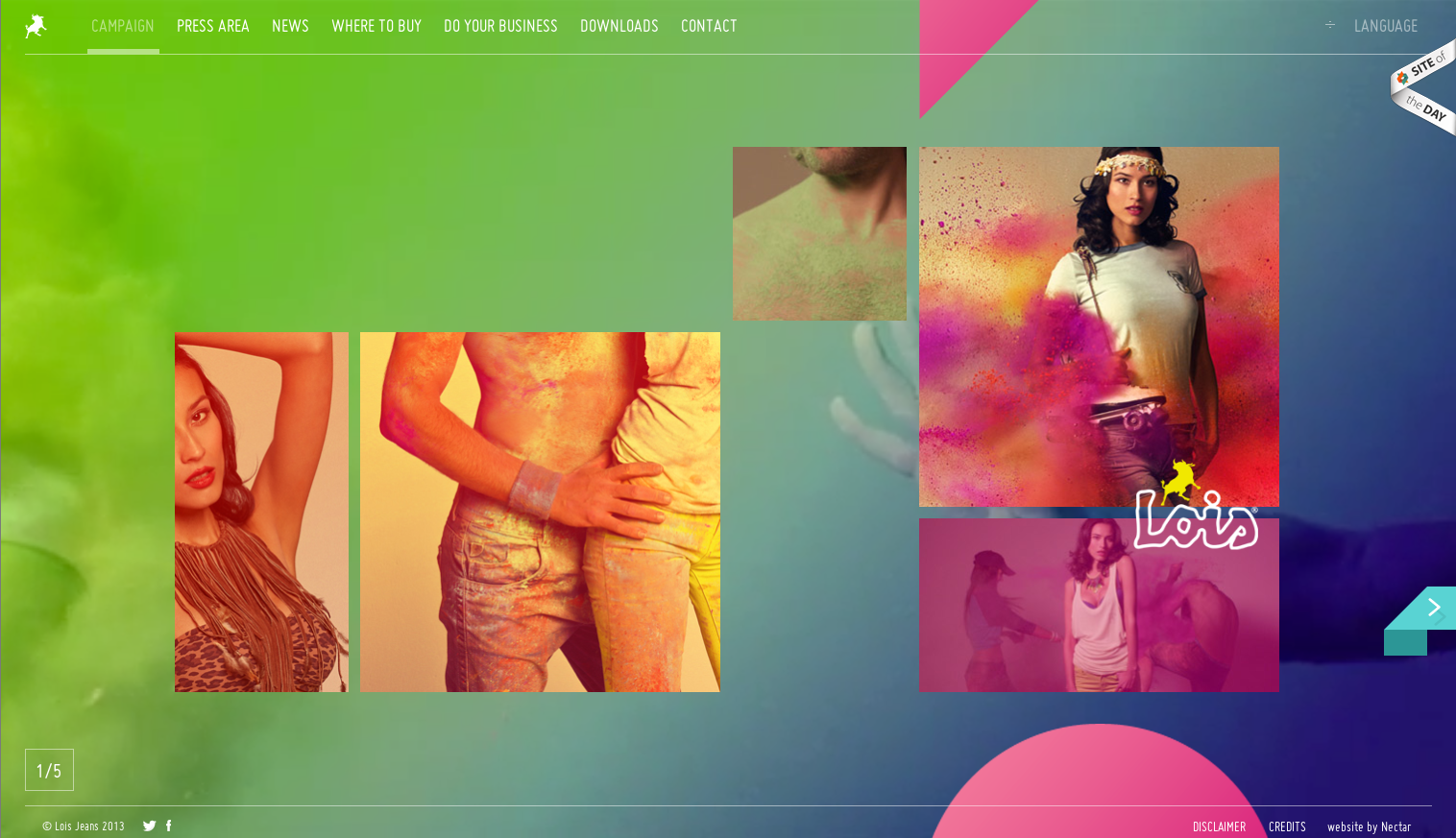
USE THE WHOLE RAINBOW: With 1980’s styles back in full effect and the new apple iOS 7 and its color scheme launching soon, this is a direction I think we will see more and more of. While it can be difficult to use a lot of different colors and have everything feel cohesive, I think the Lois Jeans, Spring/Summer Collection shows how it can be done really well. The background of the site is actually a video that has a slowly rotating color overlay, and all the photos and visual assets use bright blues and pinks. Even though this could fall apart easily, the fact that all of the colors have the same hue and saturation helps tie the piece together.
In the end, whether you decide to stick to your corporate colors or break out of your company’s comfort zone, you should make sure to keep the basics of color theory in mind. Also, as you begin to play with different directions, a handy tool for exploration is the Kuler App from Adobe. It allows you to select a color and provides good pairings for it. Plus, in the explore section of the site, there is a gallery of tons of great color combinations posted by other users. Enjoy!