I’m not so sure. I know most of you out there don’t get as excited about logos as I do, but I think everyone can appreciate a nice, well-designed corporate identity. One brand that seems to be going through an identity shake up as of late is Avery—you know, the company that makes all the custom labels and binders we use in everyday office life. Last week, I read in this article on HOW Design that Avery’s consumer products division was being sold off. The parent company Avery Dennison will continue to use the iconic three paperclip triangle identity, created back in 1975 by Saul Bass, the designer behind many well-known corporate IDs for The Girl Scouts of America, Westinghouse, AT&T, United Way, and many more.
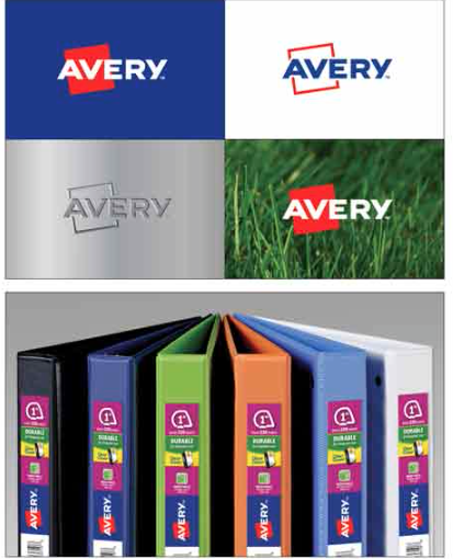
A new logo for the company now simply called “Avery” has been created by Chermayeff & Geismar & Haviv, whose work I almost always admire. Unfortunately, not this time. I don’t know what their direction was from the client, or how many rounds of revisions the project went through, but I am completely underwhelmed. (See the old versus new mark below followed by a few different uses for the new logo.)
I can understand the need for a new brand identity for Avery. If your company goes through a split, merge, or buyout then you need to reinforce that visually. But if you are going to take a well-known (and by me, well-loved) logo and change it, you have to do something more than place a red box at a slight angle behind the wordmark. This is too subtle a change, and a poor one at that.
If you are going to have an angled box (that represents paper, I assume), make the angle follow the lines of the “V” or the “A.” And why the slight off-center positioning? Is “Ave” more important than “Ry”? And, if you are going to change the logo font to lose the fun detail in the “R” crossbar, then really change it, don’t use basically the same font with one letter changed. Anyhow, before I go on too much of a rant, I am at least happy to see the Avery Dennision parent company keep the Saul Bass classic around for a while longer.