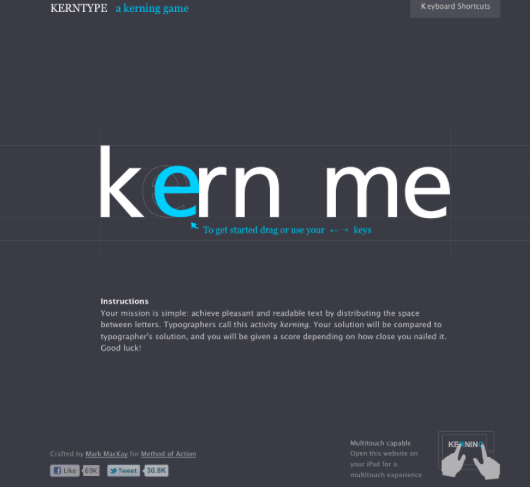
I recently came across the online game KERNTYPE and I must say I’m hooked. For those who don’t know here is a quick lesson in type layout. Kerning is the spacing between individual letters in a word. The set spacing in a font for the most part can be left alone but certain letters don’t always play so nicely together. For example, when say a “w” is next to an “a” or a capital “T” is next to any lowercase letter.
KERNTYPE gives you a word with one of these issues in it and then has you make the adjustments to what you see fit. The fun part is that the game then gives you a score based on what other professional designers have chosen as their preferred spacing. I know, I know, who wouldn’t want to play! Anyhow, after you stop rolling your eyes, keep in mind that it is staying sharp on these little items when laying out headlines or word marks for logos that sets OK designs apart from great ones.