In this day and age, a lot of marketers are quick to dismiss Direct Mail. But when done right, Direct Mail can be a much more effective way to reach your target audience (a surprising number of consumers actually prefer direct mail over emails).
If your marketing strategy points you in the direction of Direct Mail, you’ll have to come up with some stand-out packaging and messaging to be noticed. Our mailboxes may not be as full as our in-boxes, but there is usually a lot to sift through. If your direct mail piece is not a cut above the rest, it will likely go straight into the trash can (or hopefully, the recycling bin).
Like email, Direct Mail offers an opportunity for personalized messaging. But it also gives your target audience the opportunity to feel your brand, instead of just see it. There is no email that can portray the texture of a well-made invitation or the heft of a dimensional package. For luxury brands hoping to reach more discerning consumers with higher standards, this tactile experience is essential, and it’s something that can’t be accomplished with a flimsy postcard.
In the past few weeks, I’ve come across a couple of direct mail pieces from Chase and Marriott that really caught my attention. While I was not the person in my household they were addressed to, I almost wished I was — that’s how much these mailers cut through my mailbox’s daily clutter.
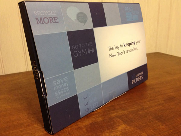
The first of two direct mail pieces came from Chase. It was a fairly heavy dimensional package with New Year’s resolutions written on the front.
Without closely inspecting the outside of the package, I wouldn’t have known that it was for a credit card. Inside was a magnetic calendar with resolution reminders printed throughout, as well as a message to Slate Blueprint users about activating the “Full Pay” feature to help them keep their resolutions. It was a great way to capture the attention of the consumer and pay it off with a premium that was not only useful, but would remind the recipient of the brand and their new online feature with every visit to the refrigerator.
Marriott took a different approach by sending what looked like a wedding invitation. For a minute, I thought I’d missed an engagement, but luckily, it was just an offer for a Marriott Rewards Card. The stationery was a heavy, textured card stock, adorned in delicate, baby blue, leaf-like swirls. The mailing address was printed in a script font, and to complete the piece, shiny, silver emblems sealed both the envelope and the card inside.
If this is what Chase and Marriott are doing, luxury brands need to go even further than this. Play with different types of textures and varnishes. Do a dimensional package that is unlike anything anyone’s ever seen before. If your product or service is unique enough, your Direct Mail piece should be just as unique.
And consider using a tiered approach. You can send dimensional packages to your top leads and a nice heavy stock roll fold to the rest of your list. If you’re holding an event, a paper invitation beats an email invitation anytime.
For offers or promotions, you can use QR codes, a drive to your Facebook Page, or an online contest to create a seamless and more engaging experience using multiple touchpoints. Direct Mail offers endless possibilities.
If you’re interested in a deeper look, Print In The Mix features a complimentary Direct Marketing case study each month, as well as long list of links to other DM case studies.