It’s the holiday season, which also means it’s the end of another year. I know we are all excitedly thinking about next year – next year’s budget, next year’s new creative, etc. – but before we get too far ahead of ourselves, you as a marketer should be taking one last look at 2015, in particular, your annual report. That pesky document that gets sent to shareholders, investors, and other decision-makers needs to be designed well.
In the heyday of print design (and even still today), the annual report was a huge project for a lot of companies. While this piece is only really required for non-profits and companies with shareholders, most travel and tourism brands could benefit from a creative annual report highlighting their past year. The finished piece should not only give a financial overview of the last 12 months, but it should also have an opening section featuring a brand message that speaks to anyone who is a member, bought a season pass, bought just a single ticket, or lives near your destination.

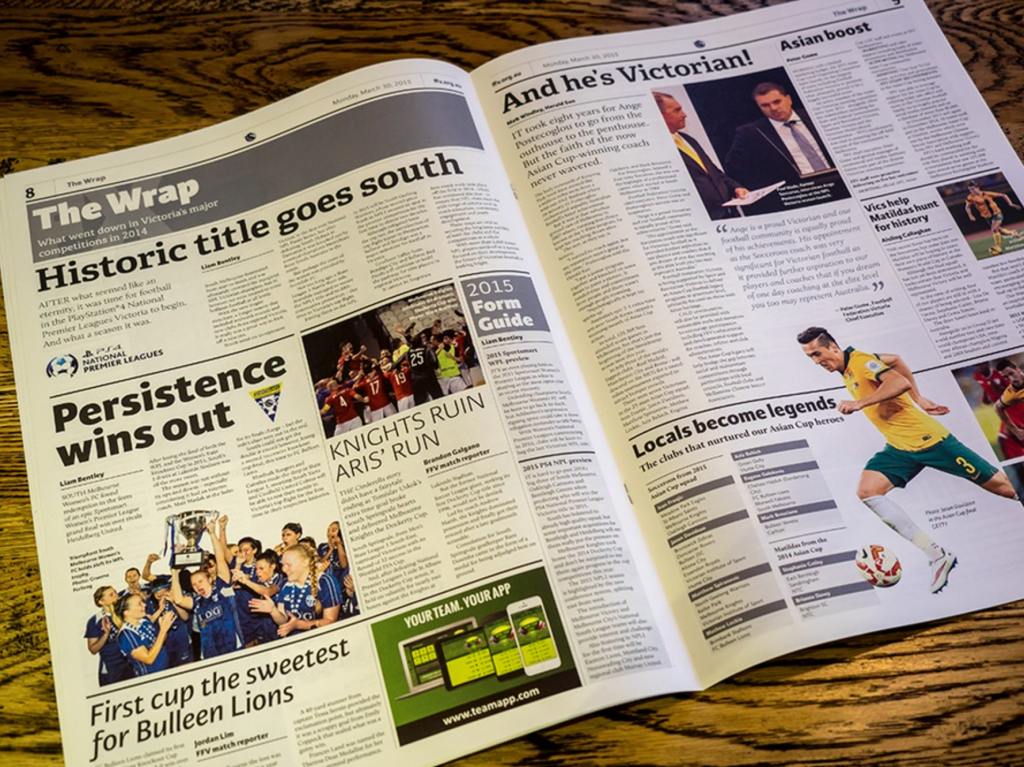
The Football Federation of Victoria designed their Annual Report to look like a sports Tabloid Paper
The annual report has traditionally been a printed booklet that was mailed to stakeholders. This format can still work, but you can go even further with a digital copy, making yours into a downloadable PDF attached to a branded email, or even into a full micro-site. Whatever the final format, you should view your annual report as an opportunity to brag a little. For the destinations and companies coming off of a successful 2015, it is a time to create a collateral piece that points to all that went right, and prelude to how 2016 will be even better. Take the time to show how hard you’ve been working.

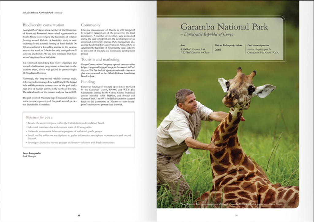
The African Parks non-profit showcased all the animals they get to help.
Once your piece has been created, you should make sure to distribute it via mail or email to the members and season pass holders I mentioned before, as well as to anyone you consider to be a potential benefactor. This is just another touch point to show off what a great product you have to deliver.

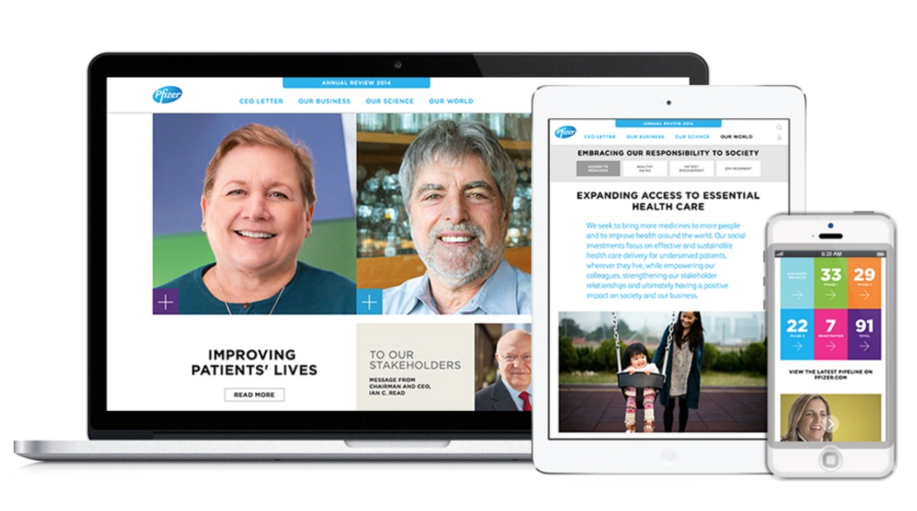
Pfizer was one of the few companies to go all digital with their entry.
However you decide to format your annual report, you should use what is likely your final creative project of the year to showcase how all of your other efforts have paid off. For more design inspiration, check out the 2014/2015 Graphis Annual Report competition, the source of all of the photos in this blog. These examples of creative annual reports offer great ways to stand out from a simple Excel spreadsheet to make your 2015 story interesting to any viewer who comes across it, and eager to see what is to come in 2016.