I recently came across this article from Fast Company featuring 7 of the most creative 404 error pages on the Internet. I’m sure at some point you have typed in a URL or clicked on a link from a Google search, only to be brought to the standard error below.
 While this gets the message across, you can (and should) go beyond the standard issue and create a custom Error page. The list from Fast Company is a great one and after reading it, I couldn’t help but poke around and create my own list. Without further ado, here is my personal “best of the broken” showcase.
The one I did lift from the Fast Company article is this hilarious page from Teehan+Lax design where they use some sweet photos that I’m sure the subjects would like to forget.
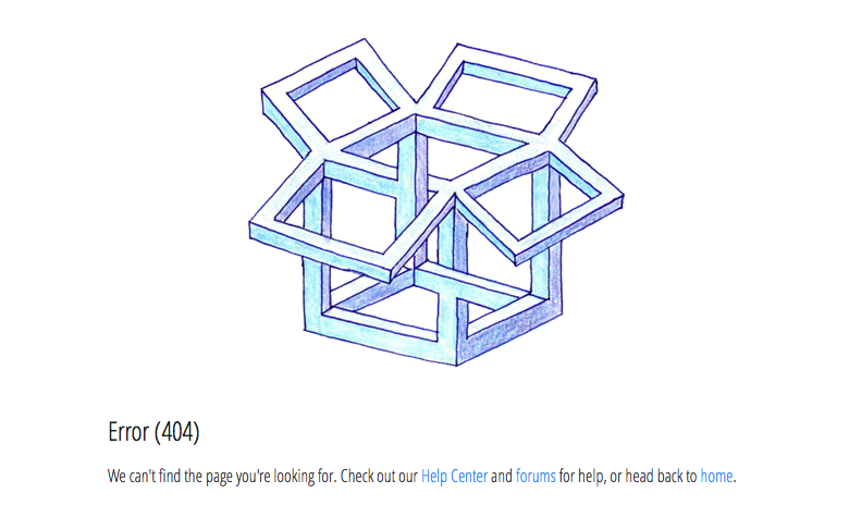
 The folks at Dropbox have used an impossible M.C. Esher-esque take on their logo to show you’ve gone to a place that can’t exist.
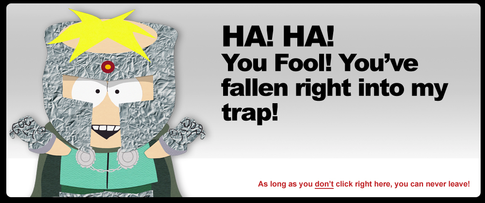
 The South Park team has created a series of error visuals and messages, all using characters from the show.
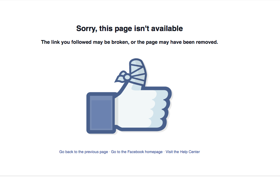
 The Facebook 404 page uses a modified version of a well-known icon.
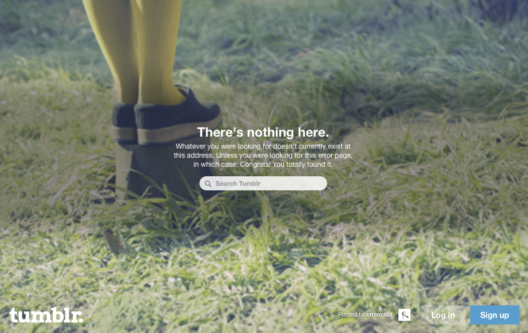
 And finally, I really like the tumblr error page. Instead of a still image, they use a series of animated gifs that were uploaded by users as the background to their broken link message.
At some point, there will be a broken link on your site or your user will make a mistake. Besides a good chuckle, creative 404 error pages can give users options for where they should go and potentially engage further with your brand. It is likely if a new visitor to your site runs into a standard broken link message, they will give up altogether. It’s best to give them a pleasant experience while also shuffling them back in the right direction.
Have you stumbled upon any memorable 404 pages? Share them with us in the Comments.