As we finish up the first month of 2013, I’d like to take a quick look back at 2012. In the design and creative corner of the marketing world there were two big issues of design that saw national attention, one for good and one for evil. Lets start with the evil.
Typically when you hear the term “Wost of…” you think of a horrible design and a snarky creative tearing it to shreds, but that’s not the case here. I’m terming it this way with a “worst for our industry” qualifier, and I am referring to the the rebrand of University of California.
In September of 2012, the University of California updated their seal and also developed a new monogram and brand identity system to go along with it. After the new system was released, a video explaining the system showed the new logos as a before-and-after example and not as a pair of logos to be used at the same time. What followed was a complete uproar. A petition that gathered over 54,000 signatures caused the University to scrap the project in December.
University of California Identity from University of California on Vimeo.
The release and quick decommission of this project shows in this case that design is not only judged by the public, but if you make a really loud stink about a new identity, it’ll be quickly reversed. I am not saying it was the best thing since sliced bread, but the new monogram and the subsequent marketing materials attached to it in my mind would do a good job of modernizing the look of the University. They even had a plan on where to use the official seal to keep with traditional educational visuals (e.g. Diplomas and Letterhead).
The reversal does a disservice to marketing in general. The project was not even given a full year to see if there was a positive effect on the admissions or the application process. I have absolutely no problem with changing direction on an organization’s creative if what you are currently running isn’t working, but you need to at least give it a chance. Honestly you need to trust the judgment and stand behind the team(s) of people you hire to do a job.
Now on a happier note, lets look at the best of 2012. Again this example is a different kind of “best”. For making the design industry look really good, I have to give my Best of 2012 to Windows 8.

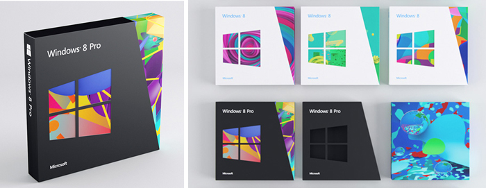
This may cause a big gasp for anyone who knows me. I have been a steady Mac user (and cheerleader) since I was in grammar school and my parents had the Apple IIe. But, in every aspect of the new Windows, whether it be the OS, the packaging or the release and marketing of the product, the design has been wholly changed from the previous version. For a major corporation like Microsoft, which has always been much less concerned with their aesthetics, placing a high level of importance on design is big leap forward both for the company and in the business world as a whole.
To learn a little more here are some links to see further info for these two stories:
Brand New – “IC, UC, We all C for California”
“Follow-up: University of California”
“Follow-up of Follow-up: University of California”
Fast.Co Design – “Windows 8: The Boldest, Biggest Redesign In Microsoft’s History”
Brand New – “Follow-up: Windows 8”