
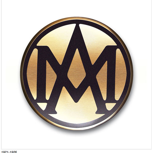
Normally when I write posts about logo redesigns, I am decrying the new look and speaking of the wondrous older version. But not so much this time. I came across an article on the Love Design Love Blog about the evolution of iconic luxury auto brand, Aston Martin’s logo since their inception in 1921. This is one company that I can say has always changed their logo for the better and, to my liking, has never made terribly drastic changes but has simply moved forward to match the style of the times. Take a look below at a few of the changes and read the full article to see the full collection over the years, plus a little bit of the actual history behind the Aston Martin company itself. It will be interesting to see what the next evolution of the Aston Martin logo will be.