
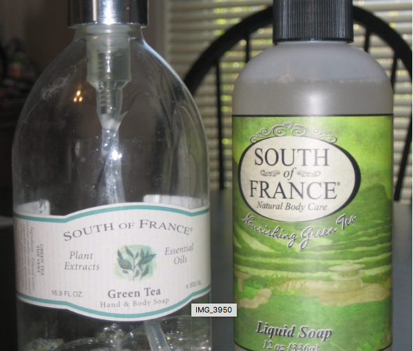
When I realized it was the same product, I was hesitant to get it, essentially because I didn’t like the new packaging. Not that the old packaging was so great, but when I bought it the first time, it seemed like a product you might find in a specialty shop instead of in the grocery store. And while the new logo was an improvement (and easier to read), the rest of the label seemed more pedestrian than French soap should feel.
I’m a little ashamed to admit it, but I almost didn’t buy it. I wanted that French soap feeling (hold the Frenchman jokes, please).
It may seem crazy, but that my friend, is the power of package design. I experienced the same kind of disappointment with Stash Tea when they changed their awesome package design to be more like every other herbal tea in the market.
I’m interested in knowing which of the South of France bottles/labels above other people like better. What do you think? Are there other brands whose package redesigns leave you unimpressed? Any that you’ve had a positive reaction to?