
Too often I cringe when I see an annual report or a website that has taken a chart or graph straight from Excel and dropped it into their layout. This is especially painful when the rest of the design’s details have been paid so much attention to. This is wrong to me for a number of reasons, the first being that I avoid designing just about anything in a Microsoft environment unless I am forced to do so and usually I am kicking and screaming the entire way (just ask anyone on the account team here at Mascola). The real reason is that the chart will stick out like a sore thumb in the piece, and your reader will focus quickly in on that whether you want them to or not.
Even more than just editing the color scheme to match the overall design of your piece, displaying “infographics,” as they have come to be called, is an important part of an overall design to any print or web project. Infographics require an overall concept, especially when you’re attempting to relay a large amount of information. This includes color scheme, photos or illustrations, font styling and more. Two organizations that I view as doing a really good job of their organization of information is The New York Times and Wired Magazine, I mention both for slightly different reasons.
The New York Times has a team dedicated to data visualization and is usually dealing with large amounts of serious information. They do an excellent job of taking these large amounts of information and making them visually interesting and easy to interpret. The above graphic is one from an article this past February about population decline in New Orleans since Hurricane Katrina.
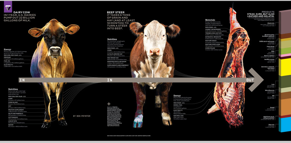
Wired Magazine on the other hand, while also creating visually interesting infographics, takes a little bit of artistic license and has fun with it, no matter how serious the topic. The picture above is one from and article about the future of our food supply.
While the subjects may differ, what these publications have in common is that they have taken the time to consider the information they need to present and have placed it in a vehicle that is interesting to the eye and easy for the reader to grasp what is being presented. Simple as that.
—-
This subject is one that has become quite popular recently a related article can be found on Smashing Magazine, and a good blog for all things infographics can be seen at Information is Beautiful.
nick healy
22 Dec, 2011 - 09:05 amAs a quick follow up to this piece I also just came across a good article on Design Taxi’s Website. The 10 Most Popular Infographics of 2011.
http://www.designtaxi.com/news/351207/Top-10-Most-Popular-Infographics-of-2011/