Let me start off by saying that the new logo that Yahoo released last week isn’t necessarily bad. It isn’t necessarily good either. I think this one can be chalked up to talented designers having to get approval from multiple levels of managers (and I’m sure Marissa herself) and the final outcome being a watered down version of a great first thought. A perfect “Design by Committee” project, as I like to call it. (UPDATE 9/10: Turns out it was worse than assumed – it wasn’t Designed by Committee, it was Designed by Mayer). The final outcome of which is a nice, safe, word mark set in Optima font, whose biggest creative plays are an emboss treatment and a cheesy animation of the exclamation point on the Yahoo homepage.
The reason I am so let down by the new logo design, however, was due to the build-up. For the 30 days leading up to the release of the new mark Yahoo featured one comp per day that they did not choose as a final logo. Genius! When you have millions of visitors per day looking at your site and you can tease them all and create some buzz about what the final logo will be, this is a great way to get free PR for the release. Unfortunately, if you are going to pull a stunt like that, the final piece of art better be pretty freakin’ awesome. Which a nice, safe, word mark set in Optima font is not. Frankly I could have probably picked at least five of the comp logos I would have rather seen chosen. Check out the gif below of all of them or see them on Yahoo’s site.

Since the release even one of their design interns seems to think his comp was better (and I agree — take a look below). He apparently posted it to his personal site and twitter account. There were enough people retweeting their agreement that he has since taken his entire site down.

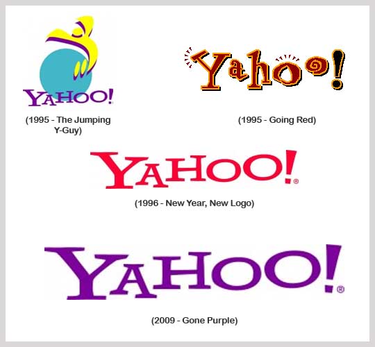
All in all, if you are going to develop a great launch strategy, the product you are releasing better live up to the hype. This is a nice execution that feels more grown up and corporate than its predecessor, but it should have been given a more subdued release. For anyone who has already forgotten Yahoo’s previous marks, take a look below for a quick trip down memory lane.
