
It’s been a busy year for rebranding with many national and international companies launching new logo designs over the past several months. With summer winding down, it’s time for show and tell as we look at which 2014 logo redesign will move to the head of the class and which needs to go back to school (and the drawing board).
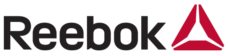
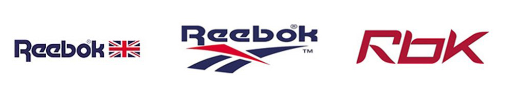
This is the oldest of the three I will talk about here, the new identity having been launched in March of 2014. You can tell from some of my earlier posts (here and here) that I like to complain about classic companies changing their marks. I will say that Reebok, however, was a company in need of a change. Their original logo of the word mark next to a British Union Jack (left logo below) was never terribly creative but at least it was unoffensive. In the 1990’s the company switched to a stylized version of the same Union Jack (center logo below) that just always seemed like an upside-down knock off of the Nike Swoosh to me. And finally, they moved into a phase of shortening their name to “Rbk” a move that—while they are a world-wide sports brand—I never felt like they had the presence to pull off.
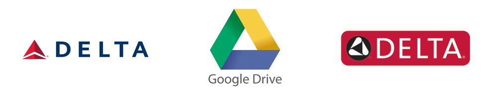
In a strategically sound decision, Reebok decided to align themselves less with specific sports and more with general fitness, specifically the fanatical world of CrossFit. The Greek delta symbol historically has stood for change, and to align yourself with this notion and a dedicated fitness community makes sense. That being said, I just can’t get over the fact that it is a symbol that has been used a lot, even by current brands like Google, Citgo, and more obviously Delta Airlines and Delta Faucets.
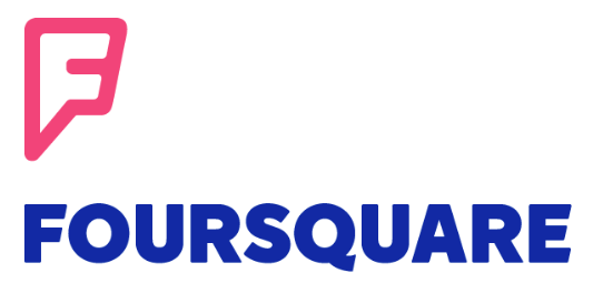
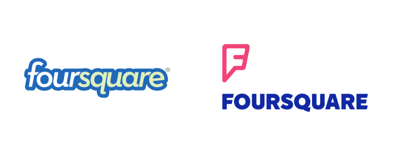
Of the three logos talked about here, I would say that this is the biggest improvement looking at the before and after. Launched in 2009 at SXSW, Foursquare has grown to become two individual apps and a community of over 50 Million users worldwide. With the launch of their new app Swarm (and its new brand) Foursquare decided to revamp their parent company logo, and I will say again it’s a welcome improvement. The old identity was comprised of a super tightly kerned italic San-serif with a big bubble outline that felt more like a children’s toy maker than a modern social media application. The new icon’s pin drop stylized “F” speaks to their location-based nature and the all caps, bold sans-serif font in the word mark seems more grown up, yet still approachable.
![]()
I don’t think it’s possible to talk about recent logo designs and not mention Airbnb. There have been seemingly endless sexual references to what the new “Bélo” icon looks like. And all sixth grade humor aside, once you get past the chatter, I think this new logo is accomplishing the same goals as Foursquare’s. The old Airbnb logo was a generic, easily forgettable identity and the new logo helps this young company grow into its own.
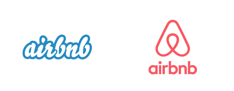
It’s just unfortunate that so many people went directly to the lowest common denominator when talking about the redesign (though it did earn the company impressive traction on social media). Personally I didn’t see anything but a stylized “A” until I was told otherwise. Only time will tell if the new identity will move past the sex jokes and become a long-standing look for the company, or if Airbnb will pull a move like Gap and retract the new work for something more tame or revert to the old bubble script typeface.
Will one of these remain the most talked about 2014 logo redesign? That has yet to be seen, after all, four months of creative potential (and potential mishaps) lie ahead. Which brands do you think could use an update this year?