
This is the second of a five-part series on ways to design your website so it stands out from your competition. See the first part on non- traditional layouts here.
After you’ve decided on the overall wire frame for your site, it’s time to move onto the website design. What will the overarching visual theme for the site be? Like I mentioned in Part 1, this is a series about ways you can stand out from your competition. There are plenty of safe directions a company can take that will look like everyone else. The following are some examples of brands that have broken away from the norm and how they did it.
Photo Dominant: 99% percent of websites out there contain visuals, and that’s great. For the majority of these sites each page will just have a header bar with a single brand image or maybe a montage, or maybe a photo gallery that takes up 1/3 of the homepage. But, then it’s on to the content, and within the copy maybe there is an inset product visual or two. In their redesign last year, Fast Company Magazine decided to buck this trend by having all articles on the site begin with a huge visual that takes up about 90% of the screen, and then the headline and maybe the first line or two of copy peaks up from the bottom of the page. On articles with multiple photos, this huge visual becomes a horizontal scrolling gallery. This doesn’t mean they’ve lost all of their well-written content – it means you just have to read a little further to get to it.

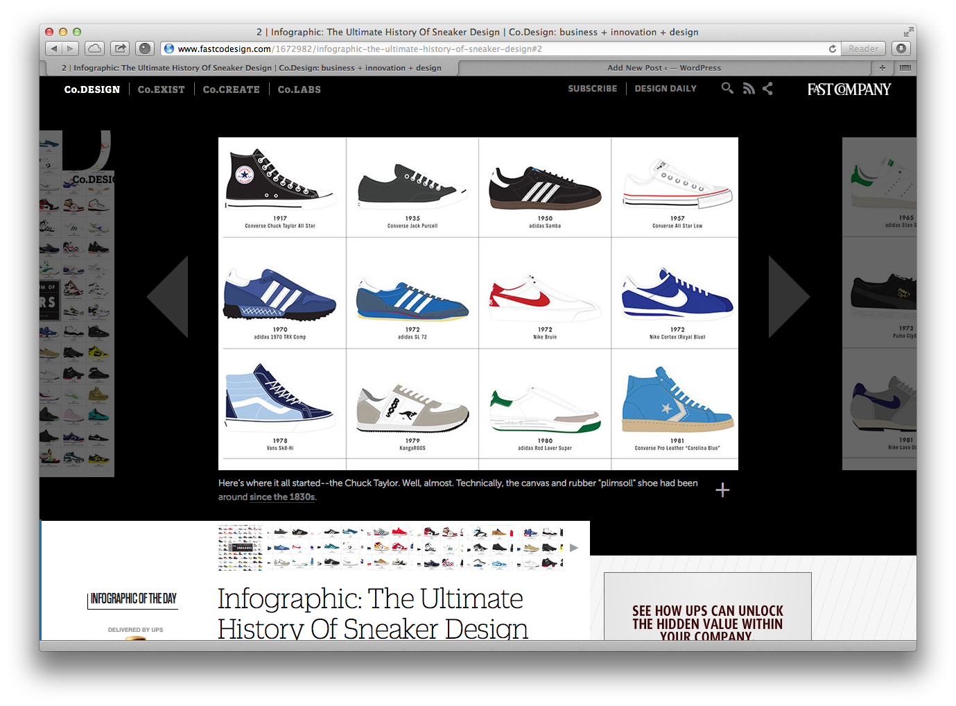
I have to say I love it (although I will freely admit I always look at the photos before I read the copy anyhow); this harkens back to printed newspaper layout and uses the concept of “Above the Fold” on the front page. I can quickly scan a page for the big visual and a very brief content tidbit before deciding to move on to the rest of the piece or go to another article on the site.
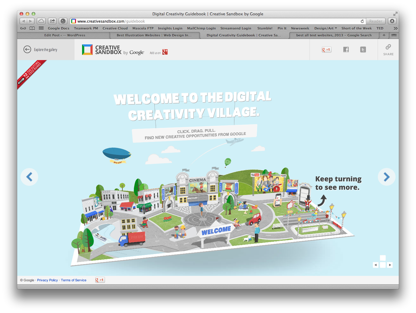
Illustration: To go in a different direction, a company might decide to make use of illustration instead of photography – either subtly or as a main element of the site’s visual theme. Unfortunately, these days illustration in corporate websites tends to get overlooked, especially in a world of “you can Photoshop that,” stock photo sites, and “Hey I’ve got an iPhone.”. But we can look to the Google Microsite “Creative Sandbox” for some really well-done illustration, which they implemented for their online user guidebook. Not only is the whole piece done in a fun paper cut-out style, but they have animated the “book” into a virtual pop-up book that will remind us all of fun books from our youth.
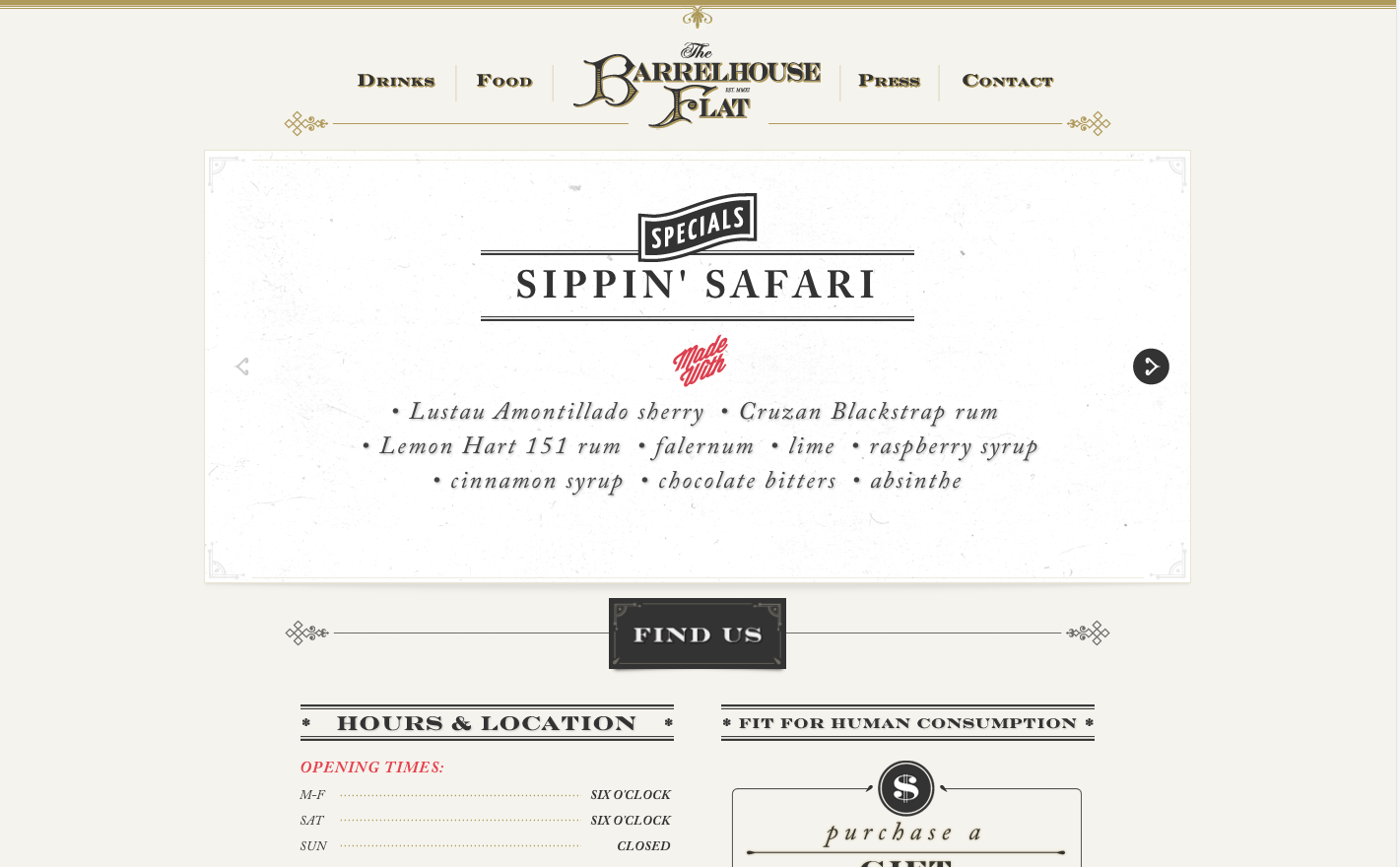
Typography Dominant: One final way, and something you see much less often, is to lose the visuals altogether and focus on the content. Depending on the amount of copy you have and how you lay it out, you can create a great layout that creatively gets the content to the forefront and people listening to what you have to say. I recently came across the website for Barrelhouse Flat, a restaurant in Chicago, and they do a great job of creating a retro theme using only typography on the homepage. Once you get to the sub-pages, they begin to add in illustrations and limited photography, but the text is still king here.
These were just a few ideas on how to shape the overall look of your online presence. No matter what direction you decide to take the visual look for your site, you need to begin with the goal of standing out from your competition. Just make sure that whatever wrapper you present your company in, it makes sense for the brand and the products or services you are selling.