
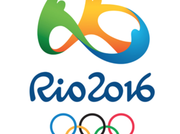
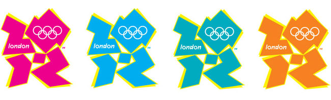
Making our way into the second week of the Summer Olympics, I have been taking a look at the overall identity of this year’s Games and I must say, I love it. The colors, the motion of the characters, the font, and even the story behind the logo all combined feel active, playful, and yet still refined. Just like the Olympics should. This is a vast improvement from the much maligned 2012 London Olympics Identity.
We have all heard the horror stories of how much trouble Rio has had in building the Olympic stadiums and athletes’ villages, but in the way of branding, they have excelled. Going beyond just the logo, the icons for individual sports, the banners within the stadiums, and even NBC’s identity and branding are doing a really good job of elevating the event to the level that a worldwide competition deserves.
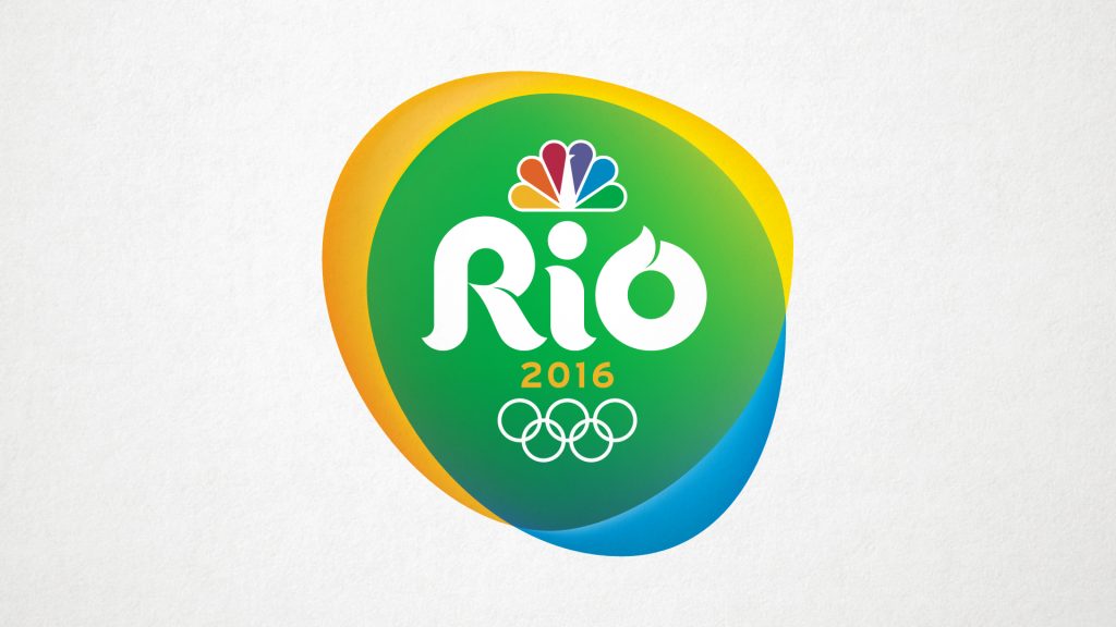
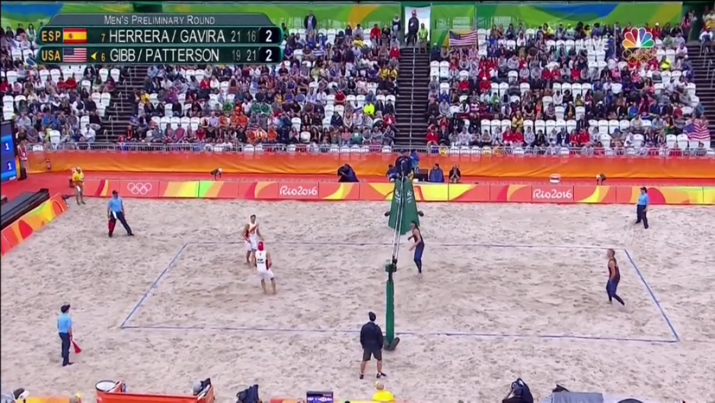
NBC’s Summer Olympics Branding
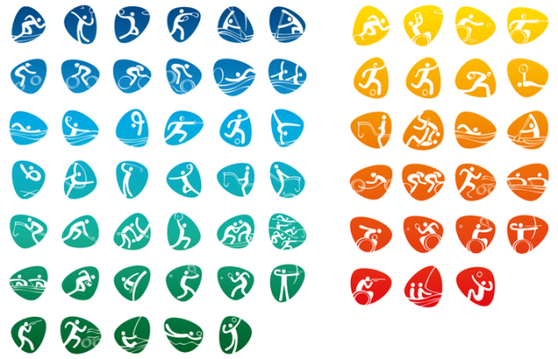
Unique icons were created for each of the Olympic events
Summer Olympics branding was carried through the stadiums
While we have been given a sneak peak of what the 2020 games branding will look like, we have to wait a while to see how it plays out beyond just the logo. I suggest in the meantime you take a look back through the logo archives of the Olympics to see how much better this year’s identity is than just the London Olympics. For a guided tour, visit the AIGA’s website where they have created an extensive post with comments from Milton Glaser on each of the past Olympics’ identities.