
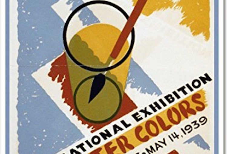
A glass of water might be the last thing you’d expect to see in art museum advertising. But it was particularly fitting in the spring of 1939. Because during that time, the Art Institute of Chicago displayed a renowned international collection of watercolor art. The design of the poster is inspired by the medium, the poster itself becoming a piece of art as well.
The most notable part of this ad just might be the colors. The red, blue, and yellow are eye-catching, fun variations of the primary colors. And the red paint seen through the yellow water shows the one color that exists nowhere else on the page. Art promoting art.
FUN FACT: Two lion statues flank the entrance of the Art Institute of Chicago. The artist Edward Kemeys unofficially named the non-identical animals: one is “On the Prowl” and the other is “Stands in an Attitude of Defiance.” (Source: Free Tours by Foot)