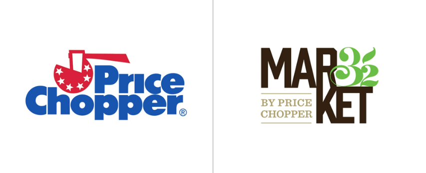
I love a good company renaming and logo redesign as much as the next guy, but as I came across the announcement of Price Chopper’s decision to rebrand themselves as “Market 32, by Price Chopper” last week I quickly took pause and then cringed… a lot.
Price Chopper, for those who don’t know, is a Schenectady, NY based grocery store chain with over 130 locations in the Northeast. Their current logo design and brand positioning has been based on high quality and low prices. This is not the chain’s first rebrand; it was known through the 1960s as Central Markets before they switched to the current Price Chopper name. After having read through the company CEO’s Facebook chat and a few articles online it is easy to tell that Price Chopper is chasing the organic, local, fresh trend in the grocery industry today. Which is great! I applaud any efforts to increase the quality of your products and make it healthier. But make a better logo too.
I don’t have as much of an issue with the new name as I do the new logo. The new logo is bad. And bad on many levels. Here are my main issues:
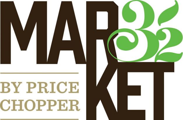
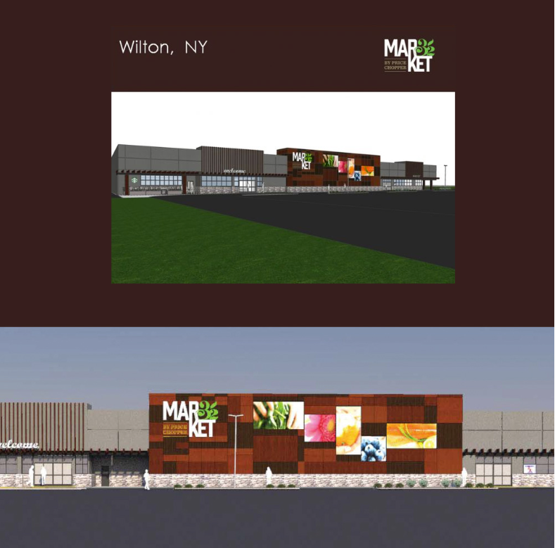
- Why split the word in two? I understand that Market is a two-syllable word, but that does not mean you can split it along two lines without the courtesy of a hyphen. Not a practical decision, as people will not be able to read it from far away (scroll to the bottom of the page to see what it looks like on the side of a building.
- Related to question #1, why use the number 32 as a hyphen? After making the asinine decision to split your single word name into two lines, why would you plant an organic looking number 32 in between the two parts of the first word. At first glance this logo now reads “Mar32ket.” If that was the intention, you’ve succeeded.
- Why include “By Price Chopper?” Of course, because no one knows Market32 and everyone knows Price Chopper. But, this just shows you are already second guessing your decision to rename. If you are going to spend over $300 million on rebranding and rehabbing over 130 stores, stand behind your decision. Your current customers are not idiots; they will see the renovations in progress and when they show up at the store once the name has changed, they’ll figure it out. By including “by Price Chopper,” any potential customer with a preference for Whole Foods (the target audience you are obviously chasing) is going to have a bad association with the budget brand Price Chopper.
A big strategic shift for a brand deserves a new identity, but it’s important to take the time to create a new brand that, while creatively engaging, can also be easily read while driving past the store front.
