
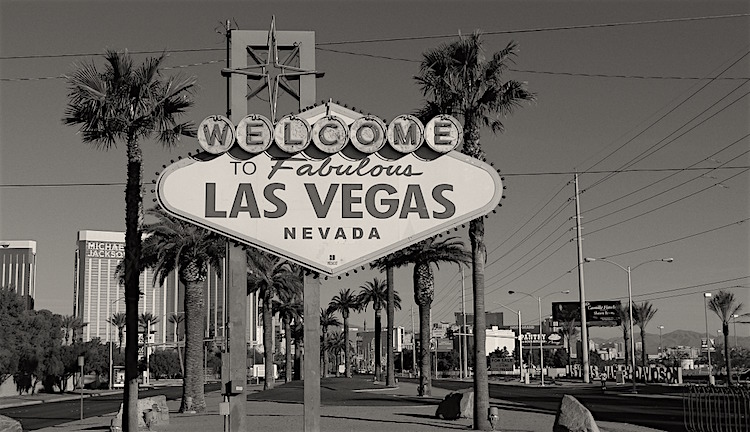
Vegas is best known for its luxury hotels, highly priced drinks, and of course, its casinos. The tagline What Happens in Vegas Stays In Vegas has really developed a persona for the city that has entered into common conversation across the country, strongly differentiating the brand from other destinations.
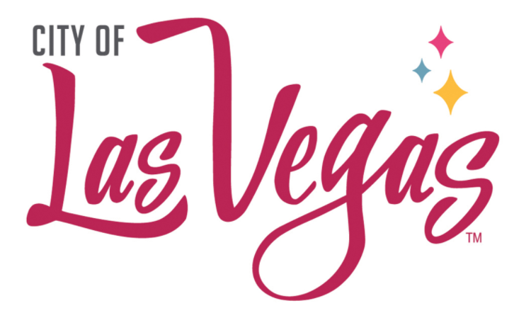
To capture that spirit, the new logo for the city of Las Vegas, which hadn’t changed since 1979, has a lighter, more playful feel than those in the past have. In, fact it’s pink, with colorful retro-style diamonds in the upper righthand corner.
Source: Travel Weekly
According to Travel Weekly, the city wanted a logo that was:
“iconic, timeless, progressive, modern, fresh and exciting with a nod to the glamorous era of yesterday.”
And that is exactly what was accomplished. The new logo builds on the positive history of Las Vegas but the look still feels fresh and progressive at the same time. City clothing, work uniforms, and vehicles will all feature the new logo.
The logo will do wonders when it comes to attracting millennials, who are all about culture, community, and fun. There is nothing that drives this target market more than a brand that embodies all of these qualities.
What do you think about the new Vegas logo?