
For those who don’t know me, I’m a design nerd. I love logos, sketching and exploring ideas for print layouts, color, designing websites, and I really love fonts. For me, a font is one of the most crucial elements of a company’s brand and can convey a strong message about its overall style. I won’t attempt to cover the entirety of design school theory in a single post, but I would like to make a few points about why I (or any other designer you work with) may choose a certain font for your logo, website, headline or collateral piece.
Fonts can be categorized into many different sets but for the purpose of this discussion, we’ll divide them into four groups: Serif, Sans Serif, Script and Display. Choosing one of these groups is the first step toward giving your brand a voice. For example, a sans serif font face often communicates a sense of sleek modern design while a nice script typeface conveys a look of elegance.

Serif Fonts: A serif is a small line or flourish attached to the end of a stroke in a letter, number or symbol (see the red in the example above). Serif fonts are often used to illustrate establishment, tradition and age, making them a great choice for University and Corporate brands. The first serif fonts can be traced back to the Roman Empire and were carved into stone structures like Trajan’s Column (where the Trajan font gets its name).
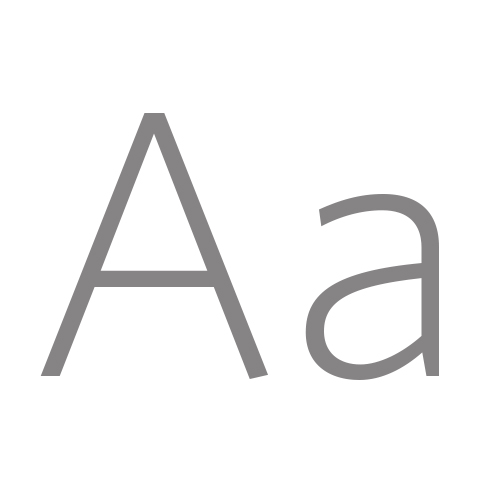
Sans Serif Fonts: From the French word sans meaning “without,” a sans serif font is devoid of extra strokes and flourishes attached to the ends of a letter, number or symbol. While sans serif fonts can also be traced back 5th century inscriptions, they generally have a more modern feel. Their lack of flourish and extraneous detail make them a first choice among minimalist designers, especially since the Bauhaus movement. The most popular of all sans serif fonts has to be Helvetica, so much so that the typeface got its own movie back in 2007.
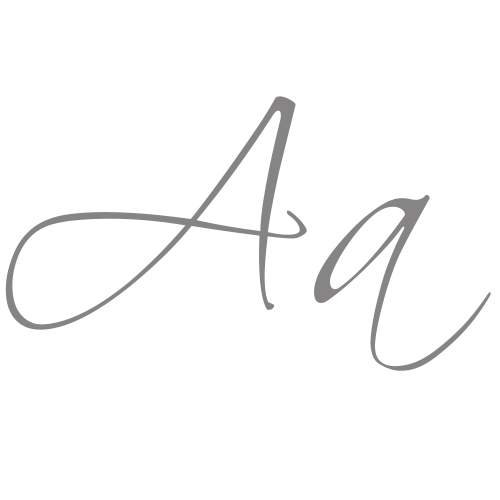
Script Fonts: A script font is designed to give the look and feel of natural handwriting. Script fonts, for me, are the original type faces, reverting back to a time before the machine printing press when all things were written by hand. They convey a personal touch and are perfect for use in travel, tourism and anywhere that a brand wants to talk “to” and not “at” its consumers.
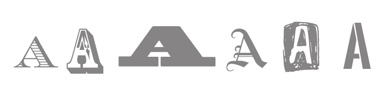
Display Fonts: By grouping all font faces into only four categories, the Display Fonts category easily becomes the largest. This is where I would place fonts that not only fall outside the three above families, but also several detailed and embellished versions of the serif, sans serif and script families. Display fonts are great for headlines, logos, billboards and other short “call-out” pieces of copy in a project, but generally do not make for great body copy.
As I mentioned earlier, these rules are not set in stone. A serif typeface can feel very modern and a script font can appear corporate depending on the specific style and context. There are millions of fonts out there, and saying the same thing while using a different font can drastically change the tone of the message. Here’s a good example:

There are other major factors that contribute to the style of a project, such as the font color, photos and graphics, and other design elements included in the piece. The best way to create a voice for your brand is to try out a bunch of different fonts and see what feels right.